
This will be the second of a series of posts I am doing on a new Pluralsight course titled, “Developing and Extending a Salesforce Community Experience with Code”.
Community Cloud (now known as Experience Cloud) allows you to easily create Lightning-based sites. Even though Salesforce offers many out-of-the-box components for these sites, many customers still want to customize sites with their own custom lightning components. This post will walk you through what might happen when a customer wants to customize their partner community.
Adding Components to Lightning Community
There are a few questions you need to ask yourself before creating a lightning component for your lightning-based Community.
- Is there not already a standard component available or a free one on the App Exchange? If so, then it is best to use one of those before creating your own.
- If you answered no to that first question, then the next thing to ask is, “Will this be an Aura or LWC component?” This is important to ask because each is developed not only with different tooling, but they involve very different developer skill sets.
- But you may not be able to fully answer that second question until you have asked yourself the last question, which is, “What type of component do you need to build?” For now (at least), Aura-based components must be used to build any layout or theme components.
Building and Configuring Lightning Web Components
Lightning Web Components were introduced in 2019 and they represent the future of Salesforce development. They were specifically developed to address limitations with the original Lightning components, which are now known as Aura components.
Below you will find the code for a multi-component solution which allows users to search for and displays products as picture tiles. The container or parent component is called displayProducts.
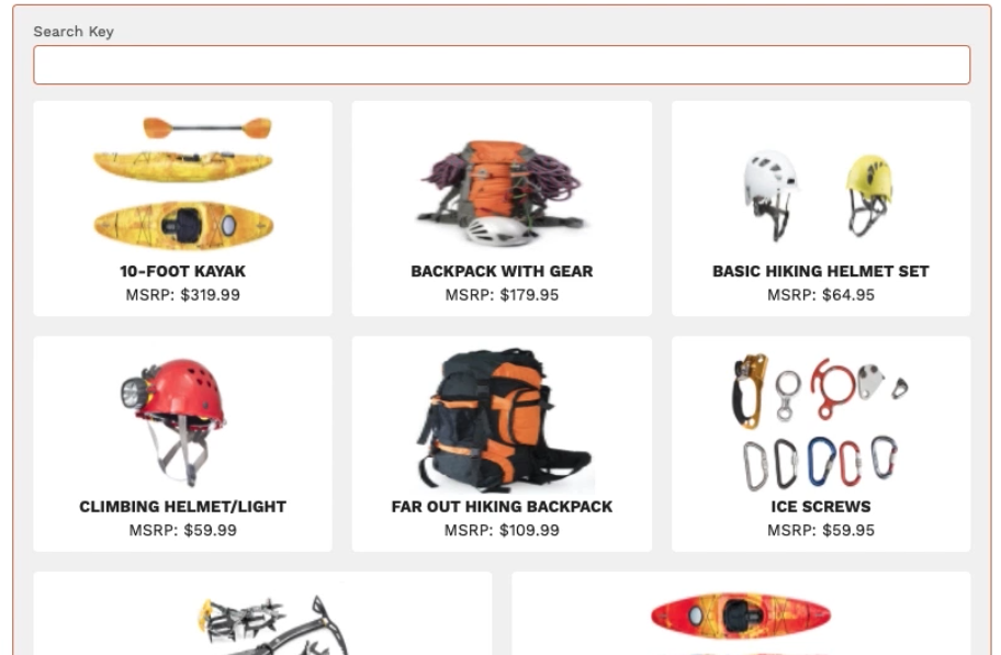
Below is the HTML markup for the displayProducts component:
<template>
    <div class="slds-card slds-var-p-around_x-small">
        <template if:true={searchBarIsVisible}>
            <lightning-input
                label="Search Key"
                type="text"
                onchange={handleSearchKeyChange}
                class="search-bar"
            ></lightning-input>
        </template>
        <template if:true={products.data}>
            <template if:true={products.data.records.length}>
                <div class="content">
                    <template for:each={products.data.records}
                        for:item="product">
                            <c-product-tile
                                key={product.Id}
                                product={product}
                                draggable={tilesAreDraggable}
                                onselected={handleProductSelected}
                                class="slds-var-m-around_x-small">
                            </c-product-tile>
                    </template>
                </div>
                <c-paginator
                    page-number={pageNumber}
                    page-size={products.data.pageSize}
                    total-item-count={products.data.totalItemCount}
                    onprevious={handlePreviousPage}
                    onnext={handleNextPage}
                ></c-paginator>
            </template>
            <template if:false={products.data.records.length}>
                <p>There are no products matching your current selection</p>
            </template>
        </template>
        <template if:true={products.error}>
            <p>An error was encountered trying to get product data</p>
        </template>
    </div>
</template>
And here is the code for the client-side JavaScript controller:
// This component is very similar to the productTilelist LWC in the E-Bikes Sample app
// https://github.com/trailheadapps/ebikes-lwc

import { LightningElement, api, wire } from 'lwc';

// getProducts() method in ProductController Apex class
import getProducts from '@salesforce/apex/ProductController.getProducts';

export default class DisplayProducts extends LightningElement {
    // Corresponds to the targetConfig properties in the meta file
    @api searchBarIsVisible = false;
    @api tilesAreDraggable = false;

    pageNumber = 1;       // Current page in the product list
    totalItemCount = 0;   // The total number of items matching the selection.
    pageSize;             // The number of items on a page.
    filters = {};         // JSON.stringified version of filters to pass to apex

    // Load the list of available products.
    @wire(getProducts, { filters: '$filters', pageNumber: '$pageNumber' })
    products;

    handleProductSelected(productId) {
        this.recordId = productId;
    }

    handleSearchKeyChange(event) {
        this.filters = { searchKey: event.target.value.toLowerCase() };
        this.pageNumber = 1;
    }

    handlePreviousPage() {
        this.pageNumber = this.pageNumber - 1;
    }

    handleNextPage() {
        this.pageNumber = this.pageNumber + 1;
    }

}
Nested inside the displayProducts component are two other components – productTile and paginator. The paginator component is one you can find the code for in this GitHub repo. The productTile component will direct the user to the product detail page and the HTML for the component is below:
<template>
<div draggable={draggable} ondragstart={handleDragStart}>
<a onclick={handleClick}>
<div class="content">
<img
src={pictureUrl}
class="product slds-align_absolute-center"
alt="Product picture"
/>
<div>
<p class="title slds-align_absolute-center">{name}</p>
<p class="slds-align_absolute-center">
MSRP:
<lightning-formatted-number
format-style="currency"
currency-code="USD"
value={msrp}
class="price"
maximum-fraction-digits="0"
></lightning-formatted-number>
</p>
</div>
</div>
</a>
</div>
</template>And the JavaScript associated with that component is below:
import { LightningElement, api } from 'lwc';

import { NavigationMixin } from 'lightning/navigation';
import PRODUCT_OBJECT from '@salesforce/schema/Product2';

/**
 * A presentation component to display a Product__c sObject. The provided
 * Product__c data must contain all fields used by this component.
 */
export default class ProductTile extends NavigationMixin(LightningElement) {
    /** Whether the tile is draggable. */
    @api draggable;

    _product;

    @api
    get product() {
        return this._product;
    }
    set product(value) {
        this._product = value;
        this.pictureUrl = value.Picture_URL__c;
        this.name = value.Name;
        this.msrp = value.MSRP__c;
    }

    /** Product__c field values to display. */
    pictureUrl;
    name;
    msrp;

    handleClick() {
        this[NavigationMixin.Navigate]({
            type: 'standard__recordPage',
            attributes: {
                recordId: this._product.Id,
                objectApiName: PRODUCT_OBJECT.objectApiName,
                actionName: 'view'
            }
        });

    }

    handleDragStart(event) {
        event.dataTransfer.setData('product', JSON.stringify(this.product));
    }
}
Building and Configuring Aura Components
For Experience cloud communities, Aura-based components will typically only come into play when there is a need to customize the communities theme and layout. The type of customizations you may want to make include:
- Detailed layout structure
- Design tokens bundle
- Custom configuration properties used to customize the layout
For example, if I wanted to create a custom theme layout, I could create an Aura component bundle named customThemeLayout. This is what the markup for such a component might look like. Take special notice of the implements attribute as that part is key to exposing this to Experience Builder.
<aura:component implements="forceCommunity:themeLayout"
               access="global">
    <!-- Represent all the columns in the layout -->
    <aura:attribute name="left" type="Aura.Component[]"  />
    <aura:attribute name="right" type="Aura.Component[]"  />
    <aura:attribute name="navBar" type="Aura.Component[]"
                                  required="false"/>

    <!-- Configuration Properties in Design File   -->
    <aura:attribute name="leftColWidth" type="Integer"
            default="7" />
    <aura:attribute name="rightColWidth" type="Integer"
            default="5" />

    <div class="navigation">
        {!v.navBar}
    </div>
	<div class="mainContentArea">
        <lightning:layout>
            <lightning:layoutItem size="{!v.leftColWidth}">
                {!v.left}
            </lightning:layoutItem>
            <lightning:layoutItem size="{!v.rightColWidth}">
                {!v.right}
            </lightning:layoutItem>
    	</lightning:layout>
    </div>
</aura:component>
The layout theme above is designed for two columns and the sizes of those columns are configureable. Since I am using configureable attributes for the column sizes, I will need to include a design file in this bundle, such as this:
<design:component label="Two Column Configurable layout">
    <design:attribute name="leftColWidth"
              label="Left Column Width" />
    <design:attribute name="rightColWidth"
              label="Right Column Width" />
</design:component>
This will be the second of a series of posts I am doing on a new Pluralsight course titled, “Developing and Extending a Salesforce Community Experience with Code”.


 saramorgan.net