This week is Dreamforce and this year it is all about Agentforce. Agentforce replaces Einstein CoPilot introduced at last year’s Dreamforce. Rather than just assisting employees, agents built with Agentforce will operate autonomously and able to do fairly complex tasks. Watching the keynote yesterday, I have to say the demos they did were very impressive.
Agents built with Agentforce are kind of like a chatbot on steroids. Much better than the chatbot Copilots introduced last year.
The conference continues today and tomorrow. If you have some time, you might want to go to Salesforce + and signup to watch for free. You can check out the schedule for today and tomorrow.
There are many things to see, but today I would suggest checking out the Agentforce keynote at 11am (CST – right after standup). There will also be another one in an hour called Meet Agentforce.
Rather than charging per license, Salesforce will charge $2 per conversation. It is intended essentially to replace some service workers, sales reps, merchandisers. It can even act as a sales coach, personal shopper or buyer agent.
This course is one of several, designed to prepare you on your journey towards completing the Salesforce Certified Sharing and Visibility Designer Exam. In this course, you will learn how to successfully setup a Territory model using Salesforce’s Enterprise Territory Management.
By the end of the course, you will know how to do the following:
Define Salesforce Enterprise Territory Management
Understand the benefits of using Enterprise Territory Management
Understand how to setup Territory Management in Salesforce
Explain the capabilities of Enterprise Territory Management and its impact on data visibility
Explain how Enterprise Territory Management impacts forecasting in Salesforce
Globomantics is a robotics company that needs to configure Enterprise Territory Management
The fictional company at the center of the story line for this course and the whole series will be Globomantics. The main character of the story will be a Salesforce Architect that has been asked to design the security model for this Salesforce Enterprise customer. The story for this course will be that the Architect is continuing her analysis of their org and is now assisting on building territories to help with account management.
If you are able to check out the course, I would love to hear your feedback. Especially, if you are using this course to help prepare you for the certification exam.
Salesforce’s annual Dreamforce 2021 was different in many ways. A very select number of people were invited to attend (thanks COVID). Most of Dreamforce was done virtually for the widest audience possible. For this reason, the content delivered came off more as an informercial and did not have the meat that Dreamforce attendees are used to. I kept waiting for a 1-800 number to appear on the screen. It had to be said.
What was the same was that there are always lots of big announcements. But due to the infomercial style, most Salesforce developers probably missed the biggest announcement – Lightning Web Runtime is available as an NPM package.
So what does this really mean? In my opinion, it is a game changer for Salesforce developers, but possibly all web developers.
For starters, the Lightning Web Runtime (LWR) means that Lightning Web Components (LWC’s) can be used to assemble web applications that render a full page in less than one second. Yes, that is what I said. BOOM!
This means that Lightning Apps can actually render as fast as we have all been hoping for since the word “Lightning” was introduced. Will the real modern high performance web architecture please stand up?
Thanks to page generation at build time, not runtime, our bar is set at subsecond full-page loads.
But the best part is that because of the release of the NPM package, serious web developers can build high performing web apps that may or may not connect to Salesforce. I’m serious. This is the flexibility that Salesforce developers have been wanting forever.
What is coming? Open Source, but no time frames on when that will be. I also imagine there will be more features and hopefully lots of demo apps.
My advice to you is to “Run, don’t walk” to the LWR guide as soon as possible. I know I am. And stay tuned here, because there is so much more to come.
Salesforce Security: Getting Started is the first in a series that is dedicated to helping you prepare for the Salesforce Certified Sharing and VisibilityDesigner exam. This course is designed to take you beyond just learning the necessary facts and give you real-world scenarios that should help prepare you on your journey towards certification.
The company at the center of this course is Globomantics, a fictional global robotics provider. They are also a new Salesforce Enterprise customer with over 20,000 employees located across the globe.
Globomantics is using Field Service Lightning to help their employees provide world-class customer service. They have hired a Solution architect to help them design a secure and scalable sharing architecture on Salesforce.
In this course, you will learn how to evaluate and configure object, field-level, role and security settings that provide access to the platform. When you’re finished, you will have the skills and knowledge to declaratively provide high-level data access to the relevant people in your Salesforce organization.
Record sharing, which is a very complex area will not be covered until the next course in this series. But that should be coming out in the next month. Stay tuned for that announcement.
Community Cloud (now known as Experience Cloud) allows you to easily create Lightning-based sites. Even though Salesforce offers many out-of-the-box components for these sites, many customers still want to customize sites with their own custom lightning components. This post will walk you through what might happen when a customer wants to customize their partner community.
Adding Components to Lightning Community
There are a few questions you need to ask yourself before creating a lightning component for your lightning-based Community.
Is there not already a standard component available or a free one on the App Exchange? If so, then it is best to use one of those before creating your own.
If you answered no to that first question, then the next thing to ask is, “Will this be an Aura or LWC component?” This is important to ask because each is developed not only with different tooling, but they involve very different developer skill sets.
But you may not be able to fully answer that second question until you have asked yourself the last question, which is, “What type of component do you need to build?” For now (at least), Aura-based components must be used to build any layout or theme components.
Building and Configuring Lightning Web Components
Lightning Web Components were introduced in 2019 and they represent the future of Salesforce development. They were specifically developed to address limitations with the original Lightning components, which are now known as Aura components.
Below you will find the code for a multi-component solution which allows users to search for and displays products as picture tiles. The container or parent component is called displayProducts.
Rendered version of the Display Products Component – clicking one of the tiles directs the user to the product detail page
Below is the HTML markup for the displayProducts component:
<template>
    <div class="slds-card slds-var-p-around_x-small">
        <template if:true={searchBarIsVisible}>
            <lightning-input
                label="Search Key"
                type="text"
                onchange={handleSearchKeyChange}
                class="search-bar"
            ></lightning-input>
        </template>
        <template if:true={products.data}>
            <template if:true={products.data.records.length}>
                <div class="content">
                    <template for:each={products.data.records}
                        for:item="product">
                            <c-product-tile
                                key={product.Id}
                                product={product}
                                draggable={tilesAreDraggable}
                                onselected={handleProductSelected}
                                class="slds-var-m-around_x-small">
                            </c-product-tile>
                    </template>
                </div>
                <c-paginator
                    page-number={pageNumber}
                    page-size={products.data.pageSize}
                    total-item-count={products.data.totalItemCount}
                    onprevious={handlePreviousPage}
                    onnext={handleNextPage}
                ></c-paginator>
            </template>
            <template if:false={products.data.records.length}>
                <p>There are no products matching your current selection</p>
            </template>
        </template>
        <template if:true={products.error}>
            <p>An error was encountered trying to get product data</p>
        </template>
    </div>
</template>
And here is the code for the client-side JavaScript controller:
// This component is very similar to the productTilelist LWC in the E-Bikes Sample app
// https://github.com/trailheadapps/ebikes-lwc

import { LightningElement, api, wire } from 'lwc';

// getProducts() method in ProductController Apex class
import getProducts from '@salesforce/apex/ProductController.getProducts';

export default class DisplayProducts extends LightningElement {
    // Corresponds to the targetConfig properties in the meta file
    @api searchBarIsVisible = false;
    @api tilesAreDraggable = false;

    pageNumber = 1;       // Current page in the product list
    totalItemCount = 0;   // The total number of items matching the selection.
    pageSize;             // The number of items on a page.
    filters = {};         // JSON.stringified version of filters to pass to apex

    // Load the list of available products.
    @wire(getProducts, { filters: '$filters', pageNumber: '$pageNumber' })
    products;

    handleProductSelected(productId) {
        this.recordId = productId;
    }

    handleSearchKeyChange(event) {
        this.filters = { searchKey: event.target.value.toLowerCase() };
        this.pageNumber = 1;
    }

    handlePreviousPage() {
        this.pageNumber = this.pageNumber - 1;
    }

    handleNextPage() {
        this.pageNumber = this.pageNumber + 1;
    }

}
Nested inside the displayProducts component are two other components – productTile and paginator. The paginator component is one you can find the code for in this GitHub repo. The productTile component will direct the user to the product detail page and the HTML for the component is below:
And the JavaScript associated with that component is below:
import { LightningElement, api } from 'lwc';

import { NavigationMixin } from 'lightning/navigation';
import PRODUCT_OBJECT from '@salesforce/schema/Product2';

/**
 * A presentation component to display a Product__c sObject. The provided
 * Product__c data must contain all fields used by this component.
 */
export default class ProductTile extends NavigationMixin(LightningElement) {
    /** Whether the tile is draggable. */
    @api draggable;

    _product;

    @api
    get product() {
        return this._product;
    }
    set product(value) {
        this._product = value;
        this.pictureUrl = value.Picture_URL__c;
        this.name = value.Name;
        this.msrp = value.MSRP__c;
    }

    /** Product__c field values to display. */
    pictureUrl;
    name;
    msrp;

    handleClick() {
        this[NavigationMixin.Navigate]({
            type: 'standard__recordPage',
            attributes: {
                recordId: this._product.Id,
                objectApiName: PRODUCT_OBJECT.objectApiName,
                actionName: 'view'
            }
        });

    }

    handleDragStart(event) {
        event.dataTransfer.setData('product', JSON.stringify(this.product));
    }
}
Building and Configuring Aura Components
For Experience cloud communities, Aura-based components will typically only come into play when there is a need to customize the communities theme and layout. The type of customizations you may want to make include:
Detailed layout structure
Design tokens bundle
Custom configuration properties used to customize the layout
For example, if I wanted to create a custom theme layout, I could create an Aura component bundle named customThemeLayout. This is what the markup for such a component might look like. Take special notice of the implements attribute as that part is key to exposing this to Experience Builder.
The layout theme above is designed for two columns and the sizes of those columns are configureable. Since I am using configureable attributes for the column sizes, I will need to include a design file in this bundle, such as this:
Salesforce.com was launched in 2000 and one of the key marketing strategies was a “No Software” protest. It took six years to offer developers a way to customize the platform. Even then, the only method of customization was to use single JavaScript files called S-Controls. The introduction of Visualforce and Apex in 2008 was only a slightly better way to access the platform programmatically.
Original No Software Logo
The multi-tenant architecture that made the Salesforce CRM so attractive to business people, did nothing to entice software developers. They saw Salesforce as a “walled garden” that was just full of annoying limits, along with out of date testing and deployment methods.
This perception continued even after Salesforce introduced the Lightning platform in 2015. Chained to a bloated JavaScript framework called Aura, Lightning components were spectacularly slow to render. Worse than that, they were supported by antiquated development tools.
Salesforce executives knew they had a problem. To address it, they made key decisions to reverse direction and also attract “serious” software developers. In this post, I will look at a few of those decisions, and some of the open source projects Salesforce is working on today.
Changing Directions – Salesforce DX
Salesforce has always embraced a strong culture that it referred to as the “Ohana”. Unfortunately, software developers were more like second class citizens in this culture. That began to change significantly in 2016 with the introduction of Salesforce DX (Developer Experience).
Better Tooling
Salesforce DX is a set of tools, centered around source-driven development. It’s introduction was spearheaded by former Microsoft and now former Salesforce employee, Wade Wegner and is part of a campaign to win the loyalty of developers. The momentum continued after Salesforce released the Salesforce Extensions for Visual Studio (VS) Code as open source on GitHub.
Unlike the rest of Salesforce, the VS Code extensions are updated every week. Salesforce actively adopts pull requests from community members, which includes feature requests and bug fixes.
The Salesforce DX features have also continued to grow. One of the most significant was the ability to develop on a local development server. Finally, developers can disconnect from Salesforce servers to develop Salesforce DX projects faster. This has improved even more so recently with the release of Change Source Tracking.
Lightning Web Components
To address performance problems associated with Lightning components, Salesforce hired another former Microsoft employee, Kevin Hill to lead the effort of creating a new programming model. This resulted in the introduction of Lightning Web Components. It also involved renaming the original Lightning components as Aura components.
Aura components would be fully interoperable with Lightning Web Components, but the newer programming model was clearly the future of Salesforce development. Lightning Web Components rendered much faster than legacy Aura components. This was due to the fact that they relied on web standards, such as web components that were now available in most major browsers.
In an effort to secure the future of Lightning Web Components, Salesforce developers have become contributing members of the Ecma International Technical Committee 39 (TC39). This committee is directly responsible for controlling how JavaScript works in all browsers. Salesforce is also a member of the World Web Consortium (W3C), which controls the working group responsible for the web components standards.
Utilizing web standards has not only resulted in huge performance gains, but it has also excited developers of popular frameworks, such as React, Angular and Vue. These developers quickly discovered that developing Lightning Web Components was instantly familiar to them.
Embracing Open Source
Salesforce did not stop there in trying to draw in more of these serious front-end developers. They have continued to offer up more of their software as open source. Even source code for jewels such as lightning base components are available on GitHub.
To help developers get up to speed quickly, Salesforce developer evangelists have created a Sample Gallery. The gallery features several real-world type applications that are updated on GitHub with every new Salesforce release. Each application showcases how to utilize Lightning Web Components, along with the latest available Salesforce features and best practices.
The latest addition to the sample gallery is the ECars sample car sales and service application. The customer facing application demonstrates the portability of Lightning Web Components and can be deployed on Heroku as a microservices application. It also features a Postgres database and uses Apache Kafka to handle incoming car diagnostic requests.
On the Horizon
Continuing with the Developer tools momentum, Salesforce has a few initiatives in beta and closed pilot.
Salesforce functions (in beta) will eliminate many of the pain points that currently exist when trying to integrate Salesforce apps with different languages and libraries. Developers will no longer have to create a separate app on platforms like Heroku. They will also not have to configure a Salesforce connected app and develop lots of code to communicate with REST API’s. Nope, all of that can use Salesforce functions to embed scalable communications directly inside of current apps.
Code Builder (still in closed Pilot) brings Salesforce Extensions for Visual Studio Code to the web browser. Everything you need to build powerful Salesforce apps is built right in. This not only includes a connection to your Salesforce org, but Git integration and productivity tools like ESlint. Unlike the wildly unpopular Developer Console, this online development tool will be a true modern developer experience.
Potential Roadblocks
Salesforce’s biggest roadblock to innovation is the same thing that brought it success decades ago. The legacy multitenant architecture that is tied to application and database core services can best be described as limiting. Salesforce is actively working to replace many of the platform services with microservices, but this is a work in progress.
Salesforce has certainly made a lot of progress in bringing down the walled garden. However, they are playing catch-up to big Industry players like Microsoft, Google and Amazon. Only time will tell over the long run how their new offerings fare.
Community Cloud (now known as Experience Cloud) has been part of the Salesforce platform for years and it is used by many companies to actively communicate with their communities of customers, partners and employees. Hence the community name.
Developing and Extending a Salesforce Community Experience with Code
Selecting a Template
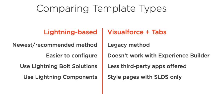
The first step in creating a new community involves selecting a template. The template determines what type of community is created.
The important thing to realize is that there are two basic template types.
Lightning-based
Visualforce + tabs
To help you decide which type might be right for you, here is a comparison of the two.
Compare Community Template Types
I would suggest you select lightning-based templates unless there is some compelling reason to use a Visualforce template.
What you will learn in this course
In this course you will be learning about..
Developing custom Lightning components to extend a Lightning-based community
Building a Visualforce community with standard Visualforce pages and Apex classes.
What code-based sharing and visibility customizations you can make to secure your community.
Opportunities to extend your community through integrations with other communities and clouds
Stay tuned for additional posts that will cover the remaining modules for this course. You can access the course on Pluralsight here. If you do not have a subscription, then you can sign up for a free 10 day trial.
If you are brand new to Lightning Web Components, then you definitely want to begin by working through the Build Lightning Web Components trail on Trailhead. The trail several projects and modules and you do not have to work them all at once. But at the very least, you should complete the first one, Quick Start: Lighting Web Components.
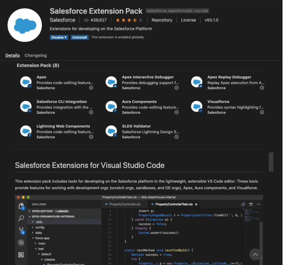
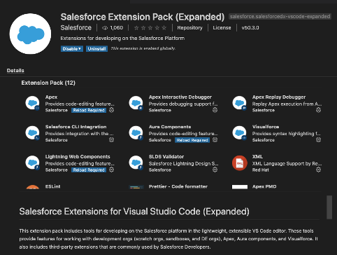
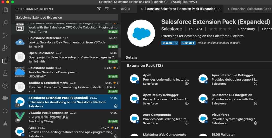
Tip # 2 – Install the Salesforce Extended Expansion Pack
Better Option is to install the Salesforce Extended Expansion Pack
The official Salesforce docs tell you to install the Salesforce Extension Pack for Visual Studio Code. But, I suggest you also/or instead install the Salesforce Extended Expansion Pack, which you can do by Clicking the Extensions icon in the left toolbar of Visual Studio Code and then selecting Salesforce Extension Pack (Extended).
Select the Extended Expansion Pack though the Extensions icon in Visual Studio Code
This extension pack will include 4 additional JavaScript libraries that you will more than likely need. They are XML, ESLint, Prettier and Apex PMD.
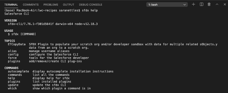
Tip # 3 – Embrace the Command Line Interface (CLI) Help
Don’t fear the CLI – Embrace it! I know that the Salesforce Extensions offers a very nifty Command Palette tool, but that does not cover everything that the CLI offers. By using the built-in help features, you not only get access to the latest docs (and that you can be rest assured of), but you can learn a lot about what the CLI Offers.
To access the help feature, just type the following sfdx help from a Terminal Window in Visual Studio Code. This will bring up results such as the following:
Access the CLI help feature from Terminal window
To drill down into one of the topics, such as the force one, use the following:
sfdx force --help
From there you can drill down as far as you need to, such as this command for accessing info about creating a Salesforce DX project:
sfdx force:project:create --help
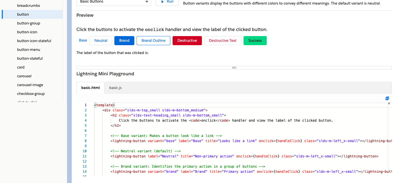
Tip # 4 – Use Base Lightning Components Whenever Possible
The Base Lightning Components that Salesforce offers not only make your life as a developer so much easier, they are highly performant than anything you might try to create yourself. So, you should check them all out and make sure to use them whenever possible.
The Component library offers a handy Lightning Mini Playground that you can use to access sample HTML and JavaScript directly.
The Component Library offers a handy Lightning Mini Playground feature
Tip # 5 – Reference the Code in the Sample App Gallery
The Sample App Gallery includes real-world code that were all designed by the incredible developers with the Salesforce developer relations group. They not only demonstrate new Salesforce features, but best practices for how to create Lightning web components.
As you begin the process, the most important one to checkout is the LWC Recipes one. This GitHub repo features very short code snippets that demonstrate how to perform certain key operations.
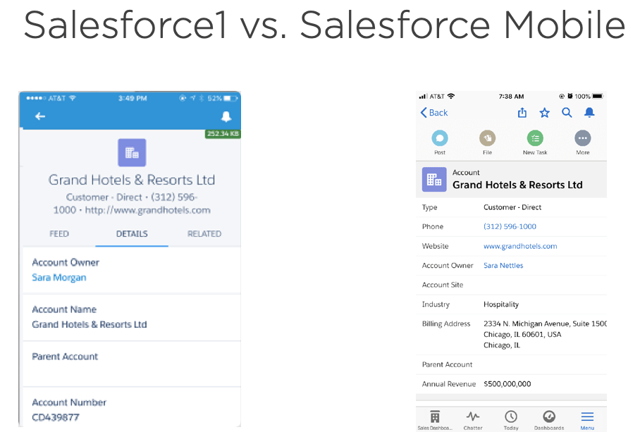
This will be the last of a series of posts I will be doing over the next few weeks. This particular post will cover working with the new Salesforce Mobile App. The series will all lead up to the introduction of my new course titled, “Customizing Salesforce with Lightning Aura Components” from Pluralsight. This course is a total re-write of my most popular course, “Customizing Salesforce with Lightning Components: Getting Started“, which was released back in early 2017. It will focus on using the new modern toolset that Salesforce offers as part of Salesforce DX.
Image comparison of Salesforce1 (left) vs New Salesforce Mobile App (right)
Right away you should have noticed that the details view includes more fields and this is primarily because of the denser view with labels to the left and less space between fields. This was a feature introduced for Lightning Experience to improve usability.
There are other big features like:
Favoriting and Search icon links in the top menu bar
There is also a really cool download icon that allows authorized users to send links to other authorized users.
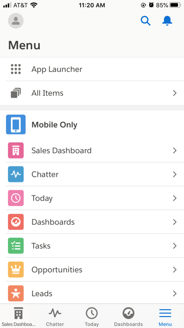
And the menu navigation has changed quite a bit and now mirrors what is found in Lightning Experience
Intuitive Navigation for Salesforce Mobile that mirrors Lightning Experience
There are also some Lightning App Builder improvements that let you preview pages better and use filters to set component visibility.
Set Component Visibility in Lightning App Builder
Using the Salesforce Mobile App QuickStart Page
There will be some steps Salesforce Administrators/Developers will need to take to support the transition to the new Salesforce Mobile App. To assist with that process, Salesforce has provided a new link in Setup called, New Salesforce Mobile App Quickstart.
The QuickStart includes a section called “Enable Your Customizations for Mobile” and in it is the following:
Run the Salesforce Optimizer for Mobile Lightning Pages Report (Beta) – Mostly includes recommendations for how you can fine-tune pages/apps for mobile. Once generated, a copy will be available in Files.
Update Your Lightning Apps for Mobile – Adds the phone form factor to apps. You can also do this manually through App Manager.
Update Your Pages for Mobile – Adds the phone form factor to desktop-assigned pages. You can also do this manually though Lightning App Builder.
Wrapping up the Course
The key points I hope you take away from the course are:
Don’t be afraid to embrace Aura components, even if you are a junior developer, a Salesforce Admin or a developer that has only worked with Visualforce. Simple Aura components are not difficult and can really improve the Lightning Experience for your customers.
Embrace the new modern tools that Salesforce offers and which this course goes over in depth. Even though you can create Aura components just using Developer Console, I strongly recommend that you embrace the modern toolset and Visual Studio Code. This will also help you to transition to creating Lightning Web Components, which can only be created with these tools.
When using Apex, always consider security since CRUD and FLS security is not automatically enforced.
However, if you can utilize the Base Lightning Components that do not use Apex, consider using them. It means you will not have to write Apex or Apex Unit tests, or worry about security.
Always consider the Usability of your components by using the Design Resources and making the components as flexible as possible.
Keep learning and pass what you learn onto others in the Salesforce community.
All of the code shown in the course, can be accessed through the following GitHub repo.
And if you are interested in going deeper with Aura components, check out my other intermediate Pluralsight course about Lightning Component Best Practices.
The course should be released soon. Tune in here for an announcement.
This will be the third of a series of posts I will be doing over the next few weeks. This particular post will cover working with Salesforce Data. The series will all lead up to the introduction of my new course titled, “Customizing Salesforce with Lightning Aura Components” from Pluralsight. This course is a total re-write of my most popular course, “Customizing Salesforce with Lightning Components: Getting Started“, which was released back in 2017. It will focus on using the new modern toolset that Salesforce offers as part of Salesforce DX.
Working with Controllers
In the last post, I walked you through creating the updateCellNumber Aura component in Visual Studio Code. I also stepped you through how to add a design file so that the placeholder value was easily modifiable in Lightning App Builder.
So far this component will only show a windows alert when the submit button is pressed. I am going to show you how to change that and have it update the Salesforce database instead.
Lightning Components have two ways of dealing with Salesforce data:
In this post, I will only covering the second method of using Apex to write server-side code.
Working with Apex and DML
Apex is strongly-typed object-oriented proprietary language developed by Salesforce. Since Salesforce is a multi-tenanted environment, Apex is subject to limits.
DML or Data Manipulation Language is what Salesforce uses to insert, update or delete a Salesforce record. To change the updateCellNumber component so that it writes to the Salesforce database, I will need to add a Class that uses both Apex and DML. The class will be named updateCellNumberApex (so that it is not named the same as the client-side JavaScript controller). Any server-side methods used by Lightning components must have the @AuraEnabled annotation. They also must be public and static. The code for the class will be as follows:
public with sharing class updateCellNumberApex {
    @AuraEnabled()
    public static void CellNumberUpdate(String cellNumber) {
        List<User> users = [SELECT MobilePhone FROM User where
                            Id =: UserInfo.getUserId()];

        if ( users.size() > 0 ) {
            users[0].MobilePhone = cellNumber;
            update users;
        }
    }
}
Once the class has been added, I will need to modify the component markup for updateCellNumber so that it is linked to this class. I do that by adding the following attribute to the aura:component tag, like this:
I will then need to switch to the client-side JavaScript controller and start by removing the code that produced a windows alert and replace it with the following:
var cellNumber = cmp.find("phone").get("v.value");
var action = cmp.get("c.CellNumberUpdate");
action.setParams({ "cellNumber" : cellNumber });
action.setCallback(this, function(response) {
    var state = response.getState();
    if (state === "SUCCESS") {
         alert(state);
     }
});
$A.enqueueAction(action);
Creating a New Open Cases Component
This component will display a list of open cases and will be named openCases. The final component will look like the following:
Open Cases Configureable Component
This Aura component will utilize the lightning:datatable base lightning component. Here is the code for the component markup:
The first part of this code is used to define the columns that will be used in the datatable. Notice that the first one is of the type url and that it has an additional definition for the typeAttributes. This is because this column will not only display the case subject, but will include a link to the case detail record.
The callback function will get whatever records are returned and then loop through those records and set the linkName so that it references the Cases record Id.
This component will utilize an Apex controller named getOpenCasesApex. It includes code needed to check for the appropriate FLS and CRUD level security. It also includes cacheable=true for the @AuraEnabled annotation in order to take advantage of caching for performance.
public with sharing class getOpenCasesApex {
    @AuraEnabled(cacheable=true)
    public static List<Case> getOpenCases(Integer numRecords) {
        // Code needed to check for proper access
        String [] caseFields = new String[] {'Id','Type','Reason','Subject','Status'};

        Map<String,Schema.SObjectField> caseMap = Schema.SObjectType.Case.fields.getMap();
        for (String fieldToCheck : caseFields) {
            if( !caseMap.get(fieldToCheck).getDescribe().isAccessible()) {
                throw new System.NoAccessException();
            }
        }

        List<Case> caseList = [SELECT Id,Type,Reason,Subject,Status FROM Case
        WHERE IsClosed = false
        LIMIT : numRecords];

        return caseList;
    }

}
And finally, it includes a numRecords input parameter, which is passed in form the value set when the component is configured in Lightning App Builder. The associated design file for this component is as follows:
<design:component label="Configurable Open Cases Component">
    <design:Attribute name="numRecords" label="Number of Records Returned" placeholder="10" />
</design:component>
In the next post, I will go over how to design components that do not require an Apex controller.


 saramorgan.net