In late 2024, there will be an instructor led 3-day course that teaches how to use Salesforce products such as Agentforce. (Available in San Francisco and London, with more opening in AMER and APAC regions).
But, my favorite and the one I plan to take advantage of is the chance to earn one exam attempt for either of these two AI certifications:
AI Associate– Allows you to provide informed strategies and principle regarding This one is pretty easy to get and you can check out this post about tips for studying to this one.
AI Specialist– Allows you to implement out-of-the-box AI Capabilities that Salesforce offers. Includes Einstein CoPilot, Prompt Builder and Model Builder. This is the one I plan on taking for free soon.
Even though these free offerings involve Salesforce AI solutions and practices, they are still a great opportunity to get up to speed on all that Salesforce is offering and prove that you know it.
This week is Dreamforce and this year it is all about Agentforce. Agentforce replaces Einstein CoPilot introduced at last year’s Dreamforce. Rather than just assisting employees, agents built with Agentforce will operate autonomously and able to do fairly complex tasks. Watching the keynote yesterday, I have to say the demos they did were very impressive.
Agents built with Agentforce are kind of like a chatbot on steroids. Much better than the chatbot Copilots introduced last year.
The conference continues today and tomorrow. If you have some time, you might want to go to Salesforce + and signup to watch for free. You can check out the schedule for today and tomorrow.
There are many things to see, but today I would suggest checking out the Agentforce keynote at 11am (CST – right after standup). There will also be another one in an hour called Meet Agentforce.
Rather than charging per license, Salesforce will charge $2 per conversation. It is intended essentially to replace some service workers, sales reps, merchandisers. It can even act as a sales coach, personal shopper or buyer agent.
Do you know about Lightning Aura Components? These are still a part of Salesforce, and even though they’re not as popular as they once were, they’re still important. I work for a company that uses them a lot, and we don’t want to change them. This is because the newer version called LWC can’t do everything that Aura components can.
In the past months, I’ve been busy working with Aura components. I’m not upset about it. In fact, I enjoy the challenges my job brings. I think working with Aura components is fun, and I like solving problems with them.
But, I’ve noticed there aren’t many resources to help people learn how to make or fix these components. Even my own online class about them has been taken down. But don’t worry! You can still find the class and learn about Lightning Aura Components if you click on this link.
I also have a place online where you can find examples of how to use them. And, I’ve written a few posts about the class that you can find from this article.
I plan to write more about the problems I face while working with these components. I might even create more examples for you to use. I hope this helps other people who are also working with Aura components.
Aura components were used for 5 years before LWC came out. That means a lot of them were made during that time.
I hope that Salesforce sees this and works on making LWC better. Right now, it can’t do everything it needs to.
I recently wrapped up a course for Pluralsight about “Salesforce Einstein: The Big Picture”. By the end of the course, I identified key areas where special attention could bring about success. Here are four specific tips and resources on preparing for your own success.
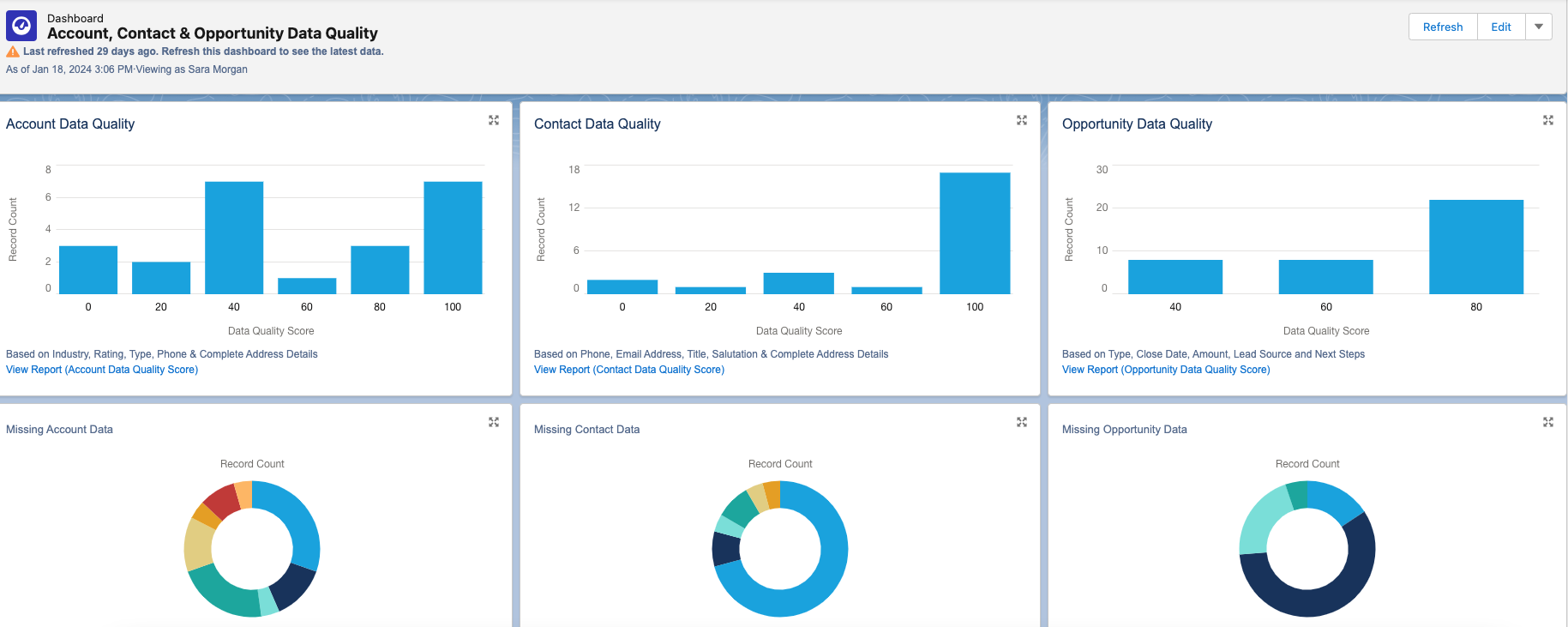
#1 – Get Your Data in Order
High quality data is crucial for the Einstein engine. Issues like missing records, duplicate entries, and inconsistent data standards can cause problems. It’s important to regularly review and update data to prevent inaccuracies.
This tool provides reports and dashboards to track data quality for various standard objects. Each dashboard includes a report that you can drill down into for further detail. You can also customize it to monitor additional custom objects.
# 2 -Consider Bias
In computer systems, bias can cause unfair outcomes, even if not on purpose. It’s important to identify and deal with bias to ensure fairness in models and data quality. Here are some types of bias to watch out for:
Measurement Bias: Occurs when data is oversimplified or mislabeled, leading to over or underrepresentation of certain groups. For example, using zip codes could unfairly include or exclude customers from certain areas.
Confirmation Bias: Happens when models reinforce existing belief systems. For instance, a recommendation system based solely on past purchases may limit options for customers.
Association Bias: Occurs when products are connected based on past assumptions, like assuming only girls play with dolls and boys with trucks.
To reduce bias, involve a diverse group in planning and design. Let everyone offer feedback freely and make sure they understand the importance of ethical design and bias detection. This group can also help review results and decide necessary changes.
When choosing training data, consider its source and potential biases. Removing biased data or fields from the dataset can prevent reinforcement of bias in AI systems.
By dealing with bias in the planning and design stages and including a diverse group of participants, we can move towards more fair and ethical AI systems. Check out this blog post for more on how AI can amplify biases.
# 3 -Go with the Flow
Models created with Prediction Builder or Recommendation Builder can produce a score that results in a recommendation. The recommendation is just a suggested action given either to an employee or a customer. For example, “Upsell this customer to the following package our company offers”.
Einstein Next Best Action is a tool used to create an “action strategy” based on that recommendation.
But what is an Action Strategy?
Quite simply it’s a flowchart that automatically executes business logic to generate some type of output. It could be an instruction given to an employee, a task assigned, an email sent, etc. The choices are endless.
For now, you can create strategies with Strategy builder or Flow builder, but be aware that Salesforce plans to retire Strategy Builder in the future, so I suggest only using Flow Builder. If you are not familiar with Flow Builder, now is the time to learn.
It is not difficult to use, but the flows you need to build may be quite complex, so the more comfortable you are using it, the better. I suggest you check out:
Are you familiar with ChatGPT? It’s quite the tool, capable of impressive feats. But let’s face it, sometimes it falls short of our expectations. The secret to unlocking its full potential, along with other GPT products from Salesforce, lies in the art of crafting the perfect prompt.
So, what’s a prompt? It’s simply the input you give to ChatGPT or any similar tool to get the desired output. But here’s the catch: getting the right answer often requires some trial and error. You ask a question, ChatGPT responds, and if it’s not quite what you need, you refine your prompt and try again. It’s a bit like a conversation where you keep tweaking your query until you hit the jackpot.
But who has the time to craft elaborate prompts every single time? Not your average Sales or Service rep, that’s for sure. That’s where prompt templates come into play. These are pre-made prompts tailored for specific scenarios. They’re like ready-made templates you can select whenever you need ChatGPT to do something for you.
But here’s the real magic: connecting these templates with your Salesforce data. This is where merge fields come in handy. They allow you to pull in information from Salesforce, making your prompts even more powerful.
Designing a prompt template, especially for something like crafting a customer email, requires careful planning. You need to consider who the email is for, what it aims to achieve, the context, any constraints, and more. It’s an iterative process that involves testing, reviewing, and refining until you get it just right.
Luckily, Salesforce provides tools like Prompt Builder to make this process easier. With Prompt Builder, you can not only include merge fields but also add logic to your templates. This opens up a world of possibilities for common business workflows like email generation or creating text for case summaries.
So, if you want to unlock the full potential of ChatGPT and take your business workflows to the next level, dive into prompt templates and Prompt Builder. And hey, if you need some tips, Salesforce has got you covered with their blog offering 7 tips for powerful prompt design. Happy prompting!
It’s understandable if you feel overwhelmed by all the AI information hitting you right now. Even though Salesforce Einstein has been around since 2016, the attention towards it lately has increased exponentially. And since 2016, Einstein has evolved and added a lot more products.
You might be feeling anxious about catching up?!?
Don’t worry. If you’re ready to dive into Einstein, but not sure where to start, I released a course on Pluralsight called, “Salesforce Einstein: The Big Picture“. This course will look at all the AI-based products Salesforce provides and offer tips for success.
The majority of products are considered out-of-the-box applications. They are embedded directly inside of CRM applications you use every day. They each serve a very specific function and are easy to use and setup.
There is also the Einstein Platform, which provides powerful tools that allow Admins and Developers to build their own customized AI-based solutions. They use multiple tools to create custom AI assistants that perform a combination of intelligent functions.
The majority of products are considered out-of-the-box applications. They are embedded directly inside of CRM applications you use every day.
Salesforce intends to embed Einstein into all clouds. But for now, it is limited to a few. It’s offered in bundles and add-ons that include:
Einstein for Sales – Designed to help sales reps close deals faster by automating busy work, offering customer insights , analytics, and generating content, like customer emails. Lead and Opportunity scoring use predictive models for lead conversion and opportunity closure.
Einstein for Service – Improves customer service by offering recommendations, routing cases effectively, generating content like emails or service replies, and offering chatbots for customers 24/7. Additionally, Service Analytics offers pre-built dashboards displaying key performance indicators derived from service data.
Einstein for Marketing – Provides scoring tools for predicting customer engagement and optimal send times, along with Messaging Insights to monitor email activities. Copy insights aid in generating effective subject lines and content, while content tools facilitate testing to identify top-performing versions. Additionally, it offers email and web recommendations for personalized experiences and expands audiences through lookalike identification.
Einstein for Commerce – Personalizes the shopper experience with product and search recommendations, which can be displayed in designated slots on a commerce site. Additionally, it provides insights to merchandisers for optimizing storefronts.
Einstein for Analytics – Utilizes assets such as datasets, lenses, dashboards, and apps, which can be built and viewed using Analytics Studio. This enables the creation of rich interactive visualizations, while Einstein Discovery offers advanced analytics, including predictive models, to deliver insights and recommendations based on CRM data.
Einstein for Admins and Developers – Offers improved global search and generating code using natural language. Additionally, includes Vision and Language products for creating AI assistants, along with Prediction Builder for developing predictive models, such as predicting late payments from invoices and displaying results in list views and record pages.
Most of the products included in the bundles are built using the following core features:
Prediction Models – Prediction models utilize machine learning to allow orgs to use data from the past to predict the future. Using a probability score value, these models can predict things like how likely it is that an invoice will be paid on time.
Recommendation Models – Machine learning is also used to recommend anything to employees and customers by connecting two Salesforce objects together. Recommendation models can then turn that recommendation into an action.
Natural Language Processing – Works by assigning labels to text. A machine learning model then learns the mapping between input and labels to predict the intent and sentiment of the input.
Chatbots – When created for customers, they can not only read the text input customers provide, but map this to a specific customer need, perform some action and return what the customer needs.
Classification – Is an AI tool that is good for assigning labels to data. Einstein uses deep learning to predict what labels need to be assigned and can consume unstructured data, like a Case description or subject field.
Generative AI – Using many of the other core features and combined with a Large Language Model (LLM), Generative AI can respond to natural language questions or requests with responses resembling what a knowledgeable human would provide.
I will be adding more posts with information from the course, but if you want to check out the Pluralsight course and do not have a subscription, you can always sign up for a 10 day free trial.
Salesforce contains a wealth of customer data that need proper security. Companies have to worry about common cyber attacks, along with laws and regulations that demand compliance. You may have heard of HIPAA, but what about the GDPR, PII, PCI, COPPA, or CPPA?
Protecting sensitive Salesforce data is an ongoing and multifaceted task. The level of protection varies by company. The first line of defense is always field and object-level permissions, along with the Salesforce Sharing Model. You can learn more about those in my Security Series.
Here are 5 additional methods to specifically help protect sensitive information in Salesforce
Encryption
Data encryption is a vital technique to protect sensitive data at rest or when it is stored. Salesforce offers two primary encryption methods: Classic Encryption and Shield Platform Encryption. Both use keys to scramble and unscramble sensitive data. Neither replace field-level security, which should always be looked at first.
Neither replace field-level security, which should always be looked at first.
Classic Encryption
Classic or Field-level encryption encrypts individual sensitive fields like SSNs. An unauthorized user will see data in the encrypted form and only users with the “View Encrypted Data” permission can view actual data.
Pros:
Strong encryption of text fields, along with data masking
Prevents exposure of sensitive data with a permission.
Included with the base user license.
Cons:
Does not encrypt existing fields or files and attachments.
Only used for new fields using a custom field type called ‘Text (Encrypted)’
Limited to 175 characters, along with many other restrictions.
Shield Platform Encryption
Enabling Shield Platform Encryption allows you to encrypt sensitive fields, files, attachments and more. It encrypts data at rest and in transit for strong protection. Provides the strongest and broadest level of protection for Salesforce data. But, careful consideration is needed before enabling.
Pros:
Allows organizations to comply with regulatory and business requirements.
Robust defense of data using a 256-bit AES key.
Allows you to encrypt existing fields and data found in other sources.
Cons:
Requires additional fees through an add-on license.
Only encrypts fields created or updated after encryption is enabled.
Personal Information Management
Available after the Winter 22 release, Enhanced Personal Information Management hides personal information fields on user records for external users (community or site users). Fields like SSN’s and credit card numbers are replaced with asterisks or custom masks.
Pros:
Limits exposure of sensitive data without additional permissions.
Simple to configure field-level settings.
Can secure up to 20 fields you select.
Cons:
Only partially hides data and is not the same as data masking.
Less flexible and secure than full encryption.
Data Masking
Data masking fully obscures sensitive data by replacing it with fictional but realistically formatted data. For example, allows testing sandboxes with masked copies of real data. Installed with a managed package.
Pros:
Fully hides actual sensitive data with fictional data.
Great protection for hiding data when working with outside contractors and sandboxes.
Cons:
Disables custom workflow rules and triggers
Complex to set up and manage.
Data Classification Fields
Create standard data classification fields, such as Compliance Categorization, Data Owner, Data Sensitivity Level and Field Usage. Allows you to classify sensitive data and understand how it is being used. Works great with Shield Platform Encryption to encrypt fields only when necessary.
Pros:
Simple classification system indicating sensitive info.
Can run SOQL queries and create reports on classification data.
Cons:
Does not secure data, just provides visual labels for awareness.
Monitoring
Protecting your sensitive data does not mean it is always secure. It is necessary to monitor user activity to look for suspicious activity and take action, if necessary. Tracks up to fifty event types, such as logins, API calls, report exports and Apex executions. Salesforce offers two ways to tracks events: traditional Event Monitoring and Real-time Event Monitoring.
Event Monitoring
Traditional Event Monitoring works with the Event Monitoring Analytics App to monitor event log files and draw insights from the data. It can not only monitor suspicious activity, but help to optimize performance by examining slow page performance.
Use the Event Monitoring Analytics App to share and monitor key performance indicators (KPI’s)
Works with Transaction security to block certain user actions and send notifications when certain events occur.
Cons:
Only monitors data within a 24 hour time period and must be done manually.
Works with API and complex alert configuration required.
Real-time Event Monitoring
Real-time Event Monitoringis used to monitor user activity in your Salesforce organization in near real-time. Does this though the use of a application monitoring service. Working with Transaction Security, policies can be created to send notifications and perform certain actions.
Pros:
Able to take action sooner that traditional event monitoring
Works with Platform Events, so you can subscribe to events published by Salesforce.
Query events stored in a big object with SOQL and batch Apex.
Cons:
Requires purchase of an add-on license.
Complex alert configuration required.
Each method for protecting sensitive Salesforce data has its own strengths and weaknesses. The best approach often involves a combination of these techniques to create a robust security framework. The key is to strike a balance between security and usability, ensuring that sensitive data remains protected while enabling users to work efficiently. Keep in mind that security is not a one-time effort but an ongoing process that should evolve alongside your organization’s changing needs and the ever-evolving threat landscape.
Of all the Salesforce certification tests I have taken, this was honestly the easiest. But, you should still prepare. As long as you use this Trailhead Trailmix, you should be fine.
I went through the majority of the trailmix. The Modules are good, but I suggest studying these docs specifically:
The big news at this year’s Dreamforce (2023) was the prominence of AI across the Salesforce platform. Generative AI is not new to Salesforce, but soon it will be baked into almost every product through the Einstein 1 Platform.
The core of this is the new Einstein One Copilot, which will function as a personal assistant in nearly all Salesforce apps including Sales, Service, Marketing, Commerce, Tableau, MuleSoft, and Canvas. At Dreamforce, Salesforce indicated that most Einstein One features will be generally available (GA) in the first quarter of 2024. Check out this link for a Salesforce cheat sheet on pricing and readiness guide.
But you don’t need to wait for 2024 to start planning. The time to start preparing for successful AI implementation is now. Proper planning and preparation is crucial for integrating AI in a way that augments human capabilities. Think of it as a journey that will require adjustments along the way.
The time to start preparing and designing a successful AI implementation is now.
So, what can you do know to prepare for this journey?
Step 1 – Learn more about Generative AI
Even if you use ChatGPT all the time, you need to learn more about Generative AI and all what all tools and capabilities are available or soon to be available in Salesforce. The best place to start is with Trailhead and the module about Generative AI Basics.
You may also want to check out Artificial Intelligence for Business. I have already gone through many modules myself and will recommend other relevant ones as I continue my own learning journey.
If you work with large datasets and have access to an enterprise or unlimited edition, you can access a free tier of Data Cloud. Your AI use cases may demand connecting all your data into a single view for customers. One that takes into account historical data to make better predictions.
It may be necessary to use Data Cloud to connect and harmonize your data. You may even have to build tools to easily embed historical data into prompts. Access to the free tier should help you to get started.
More is coming in Spring ’24. I’ll report my findings here, so stay tuned!
I’m excited by Salesforce’s consistent AI infusion across apps. With mainstream ChatGPT adoption, the timing is perfect. The Salesforce platform is ideal for delivering AI capabilities to business users. Start preparing now to ensure your AI implementation succeeds.
Unless you have been living in a cave the past 6 months, you likely have. But, what does all that mean for Salesforce?
OpenAI released two API’s earlier this year. Since then, there has been an explosion in new products that can create new data or content based on patterns from existing data. To begin with, Salesforce has a research division centered around AI. And like many tech companies they announced a partnership with OpenAI.
The result?
Einstein GPT
Einstein GPT was released in March 2023. Users can use simple sentences to create content using Salesforce CRM. This is helpful because it can change quickly when customer information and needs change. Salesforce also offers other AI-powered features, like Einstein GPT, that can help with sales, service, marketing, Slack Customer 360 apps, and Developers. These features can automatically create tasks, articles, personalized content, and even help with chats. The goal is to make customers happy and help businesses be more productive.
As with all GPT products, the user just types in what they need and the system generates it. But, it is based on Salesforce data, which is NOT available to products like ChatGPT. And, if you do not like the first response, you just type in a follow-up question or response to get something else. Kind of like having a personal assistant that has access to Salesforce data.
Slack GPT
Built by OpenAI and currently in Beta, this will let you do the same things as Einstein GPT is looks like, but directly from Slack. However, it will allow integration with models used by ChatGPT or Anthropic’s Claude. Anthropic is a rival startup (funded by Salesforce Ventures) and founded by former OpenAI founders. It currently can digest a larger quantity of text that ChatGPT and looks to be more accurate that GPT-4.
Conclusion
This is all great, but how much does it cost and will it be safe? Two very good questions. The answers are changing on an almost daily basis as the AI wars continue.
Sam Altman, CEO of OpenAI appeared yesterday in congress begging lawmakers to regulate the industry. That has got to be a first.
I will be following all this closely and will post more in this blog as I learn about things (especially those involving Salesforce). Stay tuned.
This week, Krebs Security posted how sensitive customer data was exposed on several Community sites. This included a Bank and even a Washington DC Health Community. Ouch!
How did this happen?
One can only guess. But, it was likely due to ignorance on the part of the people setting up the Community. Salesforce security is multi-layered and can be used to tightly secure data.
But, it can also be configured incorrectly. This is especially true when it comes to public facing websites such as Salesforce Communities. Or, Experience sites as they are now called.
You see, Experience/Community sites use a thing called the Guest User. This allows unauthenticated users access to the site. This is necessary when you have a public site. Think customer websites or government sites used to assist veterans, the elderly or the unemployed.
How about in disasters like epidemics or hurricanes? These kinds of sites need to be built fast and they need to allow access to the a lot of people. There are also a limited number of people with Salesforce experience. Unfortunately, that is a recipe for another type of disaster.
The Solution
If you have been asked to setup a Salesforce Experience site, first take the time to review official Salesforce docs on how to do this. This doc is a good start. There is also a great website about Learning Salesforce Experience Cloud.
But, if you are working with Salesforce on a regular basis and you are a Salesforce Developer or Architect, you need to take it a step further. As I said in the beginning, Salesforce security is multi-layered and complex. It also covers a lot more than just access to Experience Sites. In other words, there is a lot to understand.
You might want to check out some of these resources:


 saramorgan.net