
In this series, I will be sharing highlights from courses that are part of the Salesforce Certified Sharing and Visibility Designer Skill Path on Pluralsight. The skill path is designed to help anyone trying to pursue the Salesforce Sharing and Visibility Designer certification.
The first course in the series, Salesforce Security: Getting Started, will use complex customer scenarios for a global robotics provider named Globomantics. You will learn how to evaluate the use of object, field-level, role and security settings to secure the Salesforce org.
Salesforce Security Levels
From a high level, Salesforce enforces security through multiple layers or levels. At the outermost layer there is Organization access. This is controlled by login tools that allow you to control when and how a user logs in.
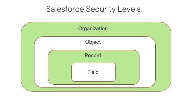
Once logged in, access to objects and fields is controlled through a combination of profiles and permission sets. Profiles must be assigned to each user and permission sets are assigned to specific users.
Record level sharing sits between the object and field level. Once a user is granted access to an object, then specific data records can be shared with them. But access can be restricted on a field level basis, providing even more granular access.
At the record level, access is controlled through data sharing. For each object, this access can be restricted through Org-wide defaults (OWD’s), which apply to all users. Roles and sharing can then be used to open this access back up to certain users.
Controlling Access to a Salesforce Organization
Controlling access to a Salesforce organization (or org) is the first line of defense. Authentication is the process of verifying that a user is who they say they are.
Salesforce authentication covers a broad spectrum of available tools where tools on the left are the least complex, such as passwords associated with a username, and tools on the right are the most complex and offer tighter security.
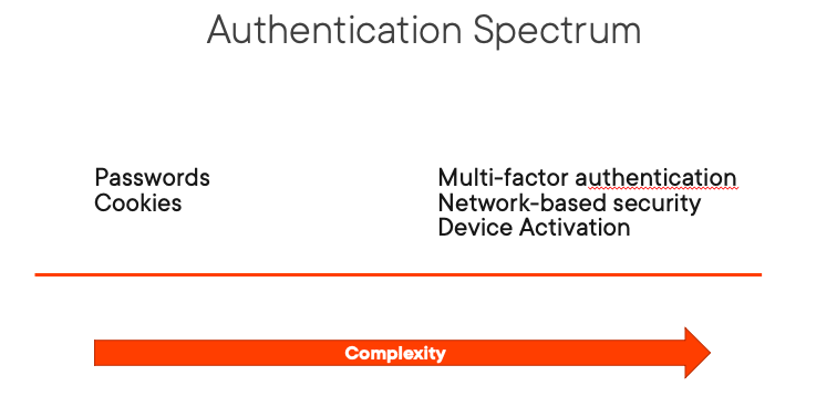
Multi-factor authentication (MFA), which you may know as 2-factor authentication involves verifying a user’s identity with two or more pieces of info. Starting in 2022, Salesforce will require customers to use MFA for internal users.
Network-based security deals with limiting where and when a user can login to Salesforce. Device activation (or identity confirmation) involves tracking information about the device used to verify a user’s identity.
Every computer or device that is connected to a public network is assigned a unique IP (Internet Protocol) address, such as 172.16.254.1. When a user logs in to Salesforce for the first time they are sent an activation email that is associated with that address.
When the Salesforce user clicks a link in that email using the same device they logged in with they will be directed back to Salesforce and the device used will be activated and considered secure. Salesforce Admins can allow users logging in from an internal network access without having to activate a device by setting a trusted IP range. This is done at the org-level and applies to all internal users.
Besides setting a trusted IP range, Administrators can restrict a user’s login IP range, along with specific login hours through permissions assigned to user’s at the profile level. By setting a login IP range, all user’s assigned to that profile, will not be able to login from an IP address outside of that range.
So remember, adding a Trusted IP ranges at the org level will only remove computer activation requirements for users logging in from a device within that range. Login IP ranges, which are applied at the profile level will instead prevent a user from logging in from a device outside the range.
Controlling Access to Object and Fields
Salesforce launched their CRM product back in 2000 and at that time the only way to grant user permissions to objects and fields was through the profile, which had a one to one relationship with the user object. As the platform grew, along with the number of permissions, things got much harder to manage.
Salesforce eventually introduced permission sets as a way to alleviate the pain points that were associated with profiles. Permission sets can be assigned to more than one user and for a while they were easier to manage.
Over time, as some orgs got bigger and had to manage lots of permission sets, even these became hard to keep up with. And so, Salesforce introduced the concept of permission set groups.
As a best practice, Administrators should use permissions or permission set groups to grant permissions and not the profile. In a nutshell, profiles should be used to restrict access and permission sets or groups should be used to grant access to specific users.
As a best practice, Administrators should use permissions or permission set groups to grant permissions and not the profile.
When thinking about granting permissions to a user, a best practice involves the principle of least privilege. This means that users should only be given the minimum permissions necessary to do their job. By keeping this in mind when approaching permissions you can be ensured that users are able to do their jobs, while also protecting the integrity of the entire org.
Access to objects are granted through CRUD permissions. CRUD stands for Create, Read, Update and Delete. Salesforce allows you to assign two other permissions to objects (View All and Modify All) that you might like to think of as super power permissions. For this reason, these permissions should be given sparingly and typically only to Administrators.
Fields access is handled with Field-level security or FLS, as it is better known. Where objects can be granted CRUD permissions, fields can only be granted read or edit access. Fields also do not have access to the super power permissions of “view all” or “modify all”.
It is important to realize that object-level access overrides FLS. For example, you cannot remove read permission for an object and then enable it for all that object’s fields. If the user does not have read access to an object, then the user can not see any of the object’s fields.
Controlling Access to Salesforce Records
Access to Salesforce records resolves around the concept of record ownership. Each record or row of data as you might like to think of it can be owned by an individual user or a group of users assigned to a queue.
Org-wide defaults (OWD’s) are the only way you have of limiting record access. All the other tools open up access to users through sharing tools or the role hierarchy.
OWD’s set the default level of access users have to each others records. Each object will be assigned a level (private, public read only or public read/write) and these can be different for internal versus external users. Public read/write transfer is a special level that is only available to lead and case objects since those are the only kinds of records that allow for a transfer.
The role hierarchy opens up access to data records vertically. Access moves from the top of the hierarchy down to the bottom. This allows managers to have access to the records of employees they manage. But peers on the same level, do not have access to each others records.
The role hierarchy opens up access to data records vertically.
Besides the role hierarchy, there are other sharing tools that open up access restricted by OWD’s. Record sharing is a huge topic and for that reason it was given an entire course for this series. I only mention it briefly here so you know where it fits with other Salesforce security access levels.
For more detail about sharing records, you will need to check out my upcoming post about the next course in this series, Share Salesforce Data Across Users, Groups and Roles. Hope you stay with me.


 saramorgan.net