Post 1 – Communicate Between Salesforce Lightning Web Components: Child to Parent

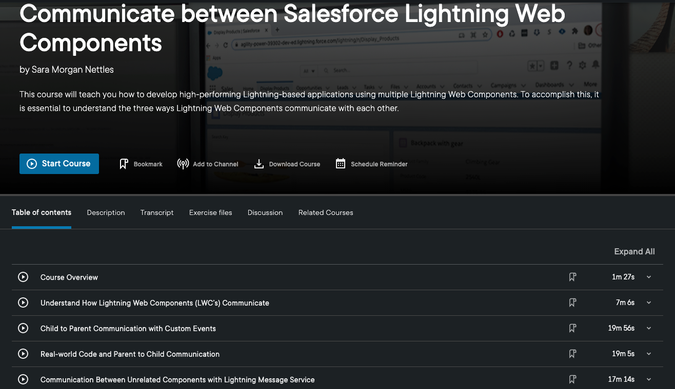
This is the latest series of posts I am doing on a new Pluralsight course I created titled, “Communicate Between Salesforce Lightning Web Components”.

Communicating With Events

In this post, I will be covering the different ways nested lightning web components can communicate from the child to the parent using custom events.

Child to Parent Component Relationship

Custom events are used to communicate up the component hierarchy. They allow a child to communicate with it’s parent component.

Even though they are based on a web standard, Lightning Web Components offer a CustomEvent interface to create and dispatch these events.

For simple events, in which no data needs to be passed to the parent component, the custom event can be created and dispatched with a single line of code, such as what you see below:

handleClick() {
	 this.dispatchEvent(new CustomEvent('clicked'));
}

The event type, which in this example is “clicked” is required. It should also follow the DOM event naming standard. This means there should be no uppercase letters or spaces. If two words are used, they should be separated with an underscore.

Child to Parent Example

I am going to show you a nested component scenario and point out the important things to consider. In this scenario the children will not be able to communicate with each other. They will only communicate with their parent component. I will also use Lightning App Builder to create a one-region app page to host this parent component. The end result will look like the following:

Simple Child to Parent Communication

Parent Component Code

In this example, there will be a parent component that will act as a container component and nested inside of it will be two children components named child and child2.

<!-- parent.html -->

<template>
    <lightning-card 
        title="Child to Parent Communication" 
        icon-name="utility:people">
        <lightning-layout vertical-align="start">
            <lightning-layout-item padding="around-small" size="6">
                <div class="slds-box_small">
                    <b>Event Name:</b>
                    <lightning-formatted-text 
                        class="slds-m-left_small" 
                        value={eventName}>
                    </lightning-formatted-text>
                    <div class="slds-box slds-m-around_small">
                        <c-child onclicked={handleButtonClicked}></c-child>
                     </div>
                </div>
            </lightning-layout-item>
            <lightning-layout-item padding="around-small" size="6">
                <div class="slds-box_small">
                    <b>Event Name:</b>
                    <lightning-formatted-text 
                        class="slds-m-left_small" 
                        value={eventName2}>
                    </lightning-formatted-text>
                    <div class="slds-box slds-m-around_small">
                        <c-child2 onclicked2={handleButtonClicked2}></c-child2>
                    </div>
                </div>
            </lightning-layout-item>
      </lightning-layout>
    </lightning-card>
</template>
//parent.js

import { LightningElement } from 'lwc';

export default class Parent extends LightningElement {
    eventName;
    eventName2;

    handleButtonClicked2(event) {
       //this.eventName2 = 'Child2 Button Clicked: ' + event.detail;
       this.eventName2 = 'Child2 Button Clicked: ' + 
            event.detail.ename + event.detail.num;
    }

    handleButtonClicked(event) {
        this.eventName = 'Child Button Clicked';
    }
    
}
<!-- parent.js.meta.xml-->

<?xml version="1.0" encoding="UTF-8"?>
<LightningComponentBundle xmlns="http://soap.sforce.com/2006/04/metadata">
    <apiVersion>50.0</apiVersion>
    <isExposed>true</isExposed>
    <masterLabel>LWC Events</masterLabel>
    <description>This is a component demonstrating how child to parent event relationship works</description>
    <targets>
        <target>lightning__AppPage</target>
    </targets>
</LightningComponentBundle>

Simple Child Component

This child component will use an inline event handler to simply pass a notification to the parent that a button has been clicked inside the child. There is not much to say about this method since it is very straight forward.

<!-- child.html -->

<template>
    <lightning-card title="Simple Child Component">
        <lightning-layout vertical-align="start">
            <lightning-layout-item padding="around-small" size="12">
                <lightning-button 
                    variant="brand" 
                    label="Fire Event from Simple Child" 
                    onclick={handleClick} 
                    class="slds-m-around_small">
                </lightning-button> 
            </lightning-layout-item>
        </lightning-layout>
    </lightning-card>
</template>
// child.js

import { LightningElement } from 'lwc';

export default class Child extends LightningElement {
    
    handleClick() {
        this.dispatchEvent(new CustomEvent('clicked'));
    }

}

Child Component Passing Data

The child2 component will be more complex since it will pass multiple data elements from the child to the parent component. The first input data field can be used to enter a text-based field and the second one allows the user to enter a number. The values for both data fields will be concatenated together and displayed as an event name in the parent component.

<!-- child2.html -->

<template>
    <lightning-card title="Complex Child Component">
        <lightning-layout vertical-align="start">
            <lightning-layout-item padding="around-small" size="12">
                <lightning-input 
                    type="text" 
                    name="inName" 
                    label="Enter a name:" 
                    class="slds-m-around_small"
                    onchange={handleNameChange}>
                </lightning-input>
                <lightning-input 
                    type="number" 
                    name="inNumber" 
                    label="Enter a number:" 
                    class="slds-m-around_small"
                    onchange={handleNumberChange}
                    placeholder="2">
                </lightning-input>
                <lightning-button 
                    variant="brand" 
                    label="Fire Event from Complex Child" 
                    onclick={handleClick} 
                    class="slds-m-around_small">
                </lightning-button> 
            </lightning-layout-item>
        </lightning-layout>
    </lightning-card>
</template>
// child2.js

import { LightningElement } from 'lwc';

export default class Child2 extends LightningElement {
    eventNumber = 0;
    copiedObject;
    eventObject = {
        num : 0,
        ename: ''
    };

    handleNumberChange(event) {
        this.eventObject.num = event.detail.value;
    } 

    handleNameChange(event) {
        this.eventObject.ename = event.detail.value;
    } 

    handleClick() {
        // Make a shallow copy into new object
        this.copiedObject = Object.assign({}, this.eventObject);
        this.dispatchEvent(
            new CustomEvent('clicked2', { detail: this.copiedObject } 
        ));
        

    }
}

The really important thing to observe in the Javascript controller for child2 is the code in the handleClick function. I am using an object to pass both the number and name value in the CustomEvent.

On the surface this seems simple, but the official Salesforce documentation includes a warning that custom events should only pass primitive data, such as a string or a number and not an object. This is because any listener (which could be a malicious one) can mutate the passed object and change the values.

To avoid this issue, I am making a shallow copy of the eventObject into a new variable named copiedObject. Only the value of the copied object is passed in the detail of the CustomEvent.

If you found this post helpful, you might want to check out my Pluralsight course, “Communicate Between Salesforce Lightning Web Components”.

Building a Complex LWC app? You may need to learn more about how they communicate

Are you a Salesforce developer that has been tasked with building a complex app involving multiple Lightning Web Components (LWC’s)?

The most important thing to understand is all the ways these components can communicate. Without a solid understanding of this concept, you may struggle and inadvertently create a poor performing or error prone app.

That is why I am happy to announce that my latest Pluralsight course, “Communicate Between Salesforce Lightning Web Components” has just been released. This is not a course for beginners new to LWC’s or Salesforce. But, if you plan on building an app that involves multiple LWC’s and you already know the basics, then this course is for you.

Communicate Between Salesforce Lightning web Components

In this course you will learn how to effectively communicate between LWC’s. First you will discover the three methods used to communicate between components. Then you will learn details about each method by seeing how they work in a real-world app. By the end of the course, you will know how to build your own high-performing Lightning-based app that is assembled with Lightning Web Components. This course is focused solely on LWC communication.

I hope you find the course useful. If you do check it out and have feedback, I would love to hear it – good or bad. You can give feedback through Pluralsight or here on my blog. Either way, it would be appreciated. Thank you.

Need to learn all about Lightning Web Components (LWC’s)?

For anyone brand new to the Salesforce Lightning Web Component Framework, learning about all this can be quite challenging. Late last year I released a Pluralsight course named, “Salesforce Lighting Web Components: The Big Picture“.

This Big Picture course was designed to slow things down and give you a high-level overview of all the pieces that make up the framework. In a nutshell, Lightning Web Components can be used to build trusted and highly performant web apps that use Salesforce data to run anywhere.

In an effort to expose more developers to this powerful framework, I have put together the following promotional preview video that you can watch for free on this blog. I hope it helps give you a better and bigger picture of all that LWC’s have to offer.

Salesforce Lightning Web Components: The Big Picture

New Pluralsight Course: Salesforce Lightning Web Components: The Big Picture

I am beyond happy to announce the release of my latest Pluralsight course, “Salesforce Lightning Web Components: The Big Picture“. This is a high-level overview of all the important things that make up this new modern and standards-based framework.

Viewers will first explore what makes up the entire Lightning Web Stack. This will include discovering the open-source Lightning Design System, which is key to the entire Lightning Experience.

Lightning Web Stack
Lightning Web Stack

Learners will also learn about the modern developer tools that Salesforce now offers. These tools offer developers a way to build robust and high-performing web apps. The tools should be instantly familiar to developers familiar with building modern web apps using frameworks like React or Vue.

Visual Studio Code and the Salesforce Extension Pack

When learners are finished, they should have the skills and knowledge of Lightning Web Components needed to build an adoption plan for their own Salesforce organizations.

And if you watch the course, please feel free to give me feedback. Good or bad. Thanks!

EDIT: Go here to access a promotional video I created for this course. It is a condensed 10 minute preview of the course that should give you a good idea of what it offers.

New Upcoming Pluralsight Course on Customizing Salesforce with Lightning Aura Components

I am VERY happy to announce that I am very close to releasing a new Pluralsight course called “Customizing Salesforce with Lightning Aura Components”. Well, kind of a new course.

Upcoming New Pluralsight Course

It is a total re-write of my most popular course (so far), “Customizing Salesforce with Lightning Components: Getting Started“, which was released back in 2017. That was right before Salesforce DX was released and all the other modern developer tools that Salesforce now promotes (for very good reasons).

In this course, all those great shiny new tools will be used to build very simple Aura Lightning Components, as they are now called. The original course used the online Developer Console, which is what Trailhead uses in all their content about Aura Components. On Trailhead, the new tools are only used for Lightning Web Components.

So, if you want to learn about building Aura Components, while also embracing the new modern toolset, this course is perfect for you. And if you want to learn about Lightning Web Components (LWC’s), then you can check out the “Building Your First Lightning Web Component (LWC) for Salesforce” course that I released earlier this year.

Both courses use the new tools, like:

Salesforce DX

Salesforce Command Line Interface

Salesforce Extensions for Visual Studio Code

Starting next week, I will be releasing a series of weekly blog posts that will feature what content will be covered in each Pluralsight module, followed by an announcement of the courses release.

So, keep an eye out for that.

Why You Really Need to Checkout the Open Source Base Lightning Components Now

As you hopefully know, Lightning Web Components (LWC’s) were introduced in 2019. Right away, Don Robins met with Salesforce expert, Chuck Liddell and they produced a free Pluralsight course, titled, “Play by Play: Understanding Lightning Web Components for Salesforce Developers“.

In that course, Chuck walked everyone through the Open Source Recipes Repo that Salesforce provided when it first released LWC’s. I remember in one part of that excellent course, that Chuck mentioned that we could not see the source code for any of the base Lightning components. Specifically, he mentioned the lightning:card component. In the course he said,

“And if I were able to look at the source code for that component, I’m sure that I would see that their attribute title is a type Aura Component Array…”

Well, the GREAT news is that Salesforce has released all those Base Lightning Components as open source on GitHub. So now everyone can see that code and learn about the best practices that Salesforce has implemented in those components.

Anyone can clone or download the source code and then follow the directions in the README to spin up these components in a scratch org. Once you do, you can open that scratch org and using the App Launcher, browse to the Base Components app. From here, they can select one of the tabs, such as the one for the Layout Components, and see first-hand how that lightning Card component works, as well as click the link to view the source.

Is that not the coolest thing in the world? I sure think so.

I would be remiss if I did not also mention the Pluralsight course I just released called, “Building Your First Lightning Web Component for Salesforce“. It is not free, but come on, Pluralsight is soooooo worth the subscription cost.

Building Your First Lightning Web Component for Salesforce Pluralsight Course is Live!!!

I am so excited to finally announce that my new Pluralsight course, “Building Your First Lightning Web Component for Salesforce” course is Live!

New Pluralisght course "Building Your First Lightning Web Component for Salesforce"

The development of this course was a labor of love for me and I have to admit something I worked so hard on. I would not compromise the quality for anything (including the three deadlines I missed). Luckily, I was working with some of the best editors in the world (huge shout out to Bentley Lignell, Stacy Sohn and Austin Allen).

As for the course, it covers the following:

  • LWC Benefits and what are Web Components
  • Setting up you development environment with Salesforce, Visual Studio Code and Salesforce DX
  • Component Design using Custom DOM events
  • Working with Salesforce Data using the Wire Adapter and Debugging with Chrome Developer Tools
  • Converting Aura components and lessons I learned
  • Testing your JavaScript with Jest

In the course, we will be building an application that will look like this:

Lead Locator LWC app

If you are looking for the final code created in this course, you can find it here.

For anyone that might not be a Pluralsight subscriber yet, here is a link to a free 10-day trial.

And finally, please feel free to send me your feedback on the course. Good or bad. I appreciate it all because it helps me to develop better content that meets your needs.

First Pluralsight Course About Lightning Published

Author-Badge_Sq-Black_SmallI am proud to announce that my first course for Pluralsight which is titled, “Getting Started Building SPA’s with Lightning Component Framework” was released last night.

Here is the course description:

Learn how to build single page apps (SPAs) with the new Lightning Component Framework.  This modern framework is built on the open-source Aura Framework and includes all the tools and technologies Salesforce enterprise developers need to build responsive and efficient component-based applications for any device. You’ll learn the basics of building Lightning components by stepping through building a single page app used to track race participation. You will also learn to apply professional styling, handle events with JavaScript client-side controllers and access data with server side controllers using Apex code. The course will finish off by showing you how to document your components and debug the Lightning App using browser tools.

I strongly believe that component frameworks like Lightning really are the future of web-based development. All of the major vendors, such as Google (with Polymer), Facebook (with React), Twitter (with Flight) and Mozilla (with Brick) are investing in component frameworks.

Lightning is also a JavaScript-based framework, but unlike the other JS frameworks like AngularJS, Backbone and React, Lightning is the only one of those frameworks that is designed specifically for enterprise applications.

So, if you do not know about Lightning and want to find out more, I hope you take the time to check out my new Pluralsight course. And, I would love to hear what you think about it.


Gotchas with using SLDSX Components

sflabs The new Salesforce Lightning collection includes a set of open-source user interface design components that were developed by Salesforce Labs. And why would you want to use these? (you might be thinking).

Well, they are built to use the SLDS (Salesforce Design System) which I blogged about in the last post. It is like Bootstrap for Salesforce. Except, that it just provides the CSS and in order to implement the components you also need JavaScript. Well, this is where the SLDSX comes in. With SLDSX you get the following beautifully styled and responsive components installed directly into your org:

  • Breadcrumbs
  • Button Groups
  • Buttons
  • Grid System
  • Images
  • Badges
  • Lists
  • Media Objects
  • Pills
  • Tabs

You can check it out at the GitHub repo here. They have a great tutorial that walks you through how to use the components.

If you are designing Lightning applications, you definitely want to be using these. But a big gotcha with trying to use them is that if you have an older Dev org in which you have already setup a namespace (like I had), then they will not work and you will get errors trying to install them.

So, in order to use them, you will have to spin up a new Dev org and make sure you enable My Domain AND that you go back to Domains in Setup and click the Deploy to Users button before you will be able to access them.

And here is one more gotcha: If you spin up a new org, you will get a copy of the SLDS as a static resource in your new org, but it is an older version. You really need to work with the latest version of the SLDS, which you can download here. You will need to first delete the current SLDS static resource and replace it with the latest version, which as of this post is 0.12.1.

Once you have them installed, just checkout the tutorial and if you have used Bootstrap you should find them pretty straightforward.

Let me know what you think.


SLDS is Bootstrap for Salesforce

I have been immersing myself in the new world of Lightning and one (note the word “one”, because there is more than one) of the most impressive parts about it is the new SLDS or Salesforce Lightning Design System.

You can just think of it as Bootstrap for Salesforce since it works very much the same as Bootstrap does for regular HTML-based apps. It just incorporates all the best Salesforce specific design options you can use into one very easy to use package.

Adding it to your Lightning app is a breeze and requires only that you use the <ltng:require> tag such as this:

<ltng:require styles="/resource/slds090/assets/styles/salesforce-lightning-design-system-ltng.css"/>

Once you have included this, then you just reference the library in your HTML code like this:

<button class="slds-button">New Button </button>

Notice the class tag? That is how you reference it. And that is how you get a nice stylized button that has the latest style that will always be updateable and current

One big gotcha to be aware of thought is that you must wrap all your HTML that uses SLDS in one div tag that uses the the class name of “slds”. For example, the button component I had listed above would not work until I added the surrounding div (NOTE: I cannot include this as formatted code because some weird WordPress issue keeps deleting the code):

That’s it. Easy peasy!

If you have not already checked it out, I strongly encourage you to do so. Every Lightning application should be using it!

Enjoy!