Do you know about Lightning Aura Components? These are still a part of Salesforce, and even though they’re not as popular as they once were, they’re still important. I work for a company that uses them a lot, and we don’t want to change them. This is because the newer version called LWC can’t do everything that Aura components can.
In the past months, I’ve been busy working with Aura components. I’m not upset about it. In fact, I enjoy the challenges my job brings. I think working with Aura components is fun, and I like solving problems with them.
But, I’ve noticed there aren’t many resources to help people learn how to make or fix these components. Even my own online class about them has been taken down. But don’t worry! You can still find the class and learn about Lightning Aura Components if you click on this link.
I also have a place online where you can find examples of how to use them. And, I’ve written a few posts about the class that you can find from this article.
I plan to write more about the problems I face while working with these components. I might even create more examples for you to use. I hope this helps other people who are also working with Aura components.
Aura components were used for 5 years before LWC came out. That means a lot of them were made during that time.
I hope that Salesforce sees this and works on making LWC better. Right now, it can’t do everything it needs to.
I have had a few people ask me this question and I think it is a good one, so I wanted to answer it in a post. First of all, for anyone not sure what the difference is between Aura and LWC, you might want to checkout this post I did.
As for the answer….wait for it…..It depends. It depends on:
How experienced you are as a Developer with JavaScript and HTML5, or modern development tools such as Visual Studio Code, Command Line Interfaces, GitHub? If you are very experienced and have even done work with React or Angular, then I would suggest starting with LWC’s. Developing with Aura components is a legacy method that Salesforce is not actively enhancing.
HOWEVER, If you are supporting or might be supporting a legacy Salesforce org? Knowing about Aura (and even Visualforce) is a very valuable skill set to have. For example, if you are doing work for a large org that is currently using many Aura components and there is no need to change these components, then having that Aura skillset can be invaluable. If you want to learn about Aura components, you night want to check out this course I did on Pluralsight. Most importantly, as of early 2023, LWC’s cannot be used to override standard buttons. (NOTE: HOWEVER, in 2024, allowing for the override was added to the Roadmap for LWC, so this limitation is being actively worked on).
Like Salesforce Evangelists, I do think that LWC’s are the better alternative in terms of component performance, but if all you need to build are very simple components, then there is no reason why you cannot start with Aura and transition to LWC’s. To be entirely honest, LWC’s are more challenging to create for developers that are not already familiar with modern web development.
I hope this post helps anyone not sure about which technology to approach first. Feel free to reach out to me if you have additional questions or concerns.
Whichever flavor you select, the tip in this post applies to both Aura components and the new Lightning web components.
So what does creating Admin friendly Lightning components mean?
In a nutshell, it means making your component as configureable as possible to anyone using it to assemble Lightning pages using Lightning App Builder. This is done by using a meta configuration file for LWC’s or a design resource file for Aura components.
Whichever flavor you chose, the tip in this post applies to both Aura components and the new Lightning web components.
To give you an example of how that is done for LWC’s, let’s look at the code for the eBikes sample app, which can be found here for the LWC version. This is what the HTML for that component looks like:
import { LightningElement, api, wire } from 'lwc';

// Ligthning Message Service and message channels
import { publish, subscribe, MessageContext } from 'lightning/messageService';
import PRODUCTS_FILTERED_MESSAGE from '@salesforce/messageChannel/ProductsFiltered__c';
import PRODUCT_SELECTED_MESSAGE from '@salesforce/messageChannel/ProductSelected__c';

// getProducts() method in ProductController Apex class
import getProducts from '@salesforce/apex/ProductController.getProducts';

/**
 * Container component that loads and displays a list of Product__c records.
 */
export default class ProductTileList extends LightningElement {
    /**
     * Whether to display the search bar.
     * TODO - normalize value because it may come as a boolean, string or otherwise.
     */
    @api searchBarIsVisible = false;

    /**
     * Whether the product tiles are draggable.
     * TODO - normalize value because it may come as a boolean, string or otherwise.
     */
    @api tilesAreDraggable = false;

    /** Current page in the product list. */
    pageNumber = 1;

    /** The number of items on a page. */
    pageSize;

    /** The total number of items matching the selection. */
    totalItemCount = 0;

    /** JSON.stringified version of filters to pass to apex */
    filters = {};

    /** Load context for Ligthning Messaging Service */
    @wire(MessageContext) messageContext;

    /** Subscription for ProductsFiltered Ligthning message */
    productFilterSubscription;

    /**
     * Load the list of available products.
     */
    @wire(getProducts, { filters: '$filters', pageNumber: '$pageNumber' })
    products;

    connectedCallback() {
        // Subscribe to ProductsFiltered message
        this.productFilterSubscription = subscribe(
            this.messageContext,
            PRODUCTS_FILTERED_MESSAGE,
            (message) => this.handleFilterChange(message)
        );
    }

    handleProductSelected(event) {
        // Published ProductSelected message
        publish(this.messageContext, PRODUCT_SELECTED_MESSAGE, {
            productId: event.detail
        });
    }

    handleSearchKeyChange(event) {
        this.filters = {
            searchKey: event.target.value.toLowerCase()
        };
        this.pageNumber = 1;
    }

    handleFilterChange(message) {
        this.filters = { ...message.filters };
        this.pageNumber = 1;
    }

    handlePreviousPage() {
        this.pageNumber = this.pageNumber - 1;
    }

    handleNextPage() {
        this.pageNumber = this.pageNumber + 1;
    }
}
Notice that the searchBarIsVisible and titlesAreDraggable properties use the @api decorator and that the developer has kindly added a TODO comment here suggesting that the normalized value may come as a boolean, string or otherwise.
The reason the values may some across differently is because these two properties are configureable in the design file, but only for Record Pages and Community default pages. This means that anyone can use Lightning App Builder to change those values (well, at least for Record and Community Default pages).
To see how this is done, let’s take a look at the meta configuration file for this component:
Notice there are two targetConfig entries. One is for lightning__RecordPage and the other is for lightningCommunity__Default, but they both define the same properties. Even though these properties have default values of false, anyone assembling the pages for the two targeted page types can change these values in Lightning App Builder.
Consider this Change to the Configuration
Not to be too critical, but I can see room for improvement in the way the productTileList component was configured. After all, there is always room for improvement in anything we do, right?
The first change I would make is to add a description for all the targetConfig properties. The description is typically a short sentence, but it appears as a tooltip in Lightning App Builder. This sentence could be used to indicate to the app assembler that the property value should be either true or false and not any other value perhaps?
The end result would look something like the following (notice the tooltip on the right):
Lightning App Builder used to configure the productTileList component.
For more tips about what you can do to make your components configureable, check out this great developer doc page.
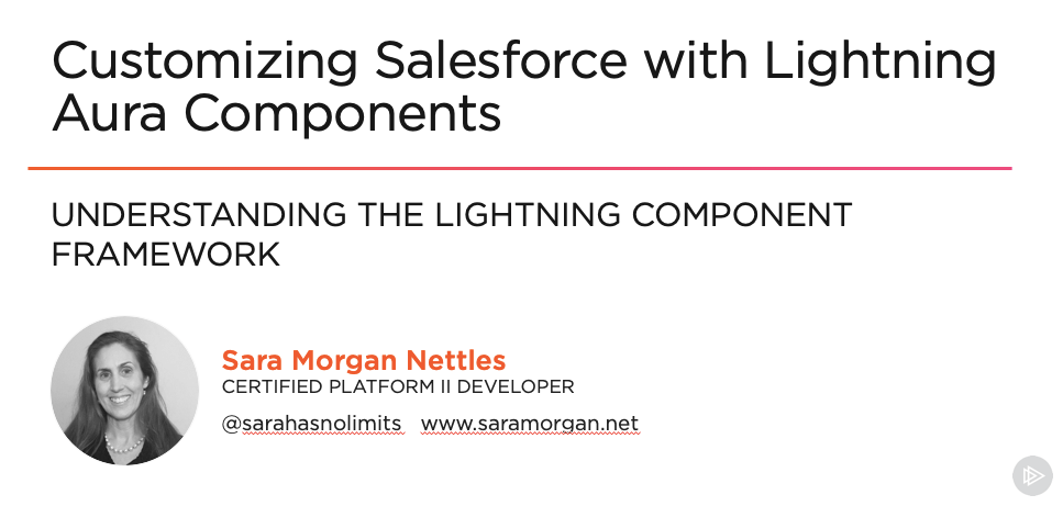
I am very proud to announce the release of my latest Pluralsight course, “Customizing Salesforce with Lightning Aura Components“. This is actually a total re-write of my most popular course, “Customizing Salesforce with Lightning Components”, released in 2017. The key word change in the title is the addition of the word, “Aura“.
New Pluralsight Course, which includes working with VS Code and the CLI
This course is different because at the time that course was released, Lightning Components were not called Lightning Aura Components AND most importantly, the new modern toolset known as Salesforce DX was not yet available. There were also no Lightning Web Components available yet.
I personally believe that for many developers, transitioning to LWC would be much easier if they were to first learn to build simple Aura components using the new modern tools first.
In this course, all those great shiny new tools will be used to build very simple Aura Lightning Components. The original course used the online Developer Console, which is what Trailhead still uses in all their content about Aura Components. On Trailhead, the new tools are only used for Lightning Web Components.
So, if you want to learn about building Aura Components, while also embracing the new modern toolset, this course is perfect for you. And if you want to learn about Lightning Web Components (LWC’s), then you can check out the “Building Your First Lightning Web Component (LWC) for Salesforce” course that I released earlier this year.
Either way, you will be knowledgeable in all the latest that Salesforce has to offer. I personally believe that for some developers, transitioning to LWC would be much easier if they were to first learn to build simple Aura components using the new modern tools first.
This course includes a GitHub Repo that features all the code covered in the course. The material covered includes the following:
Understanding the Lightning Component Framework
Refer to the following blog post #1 . In this post/Pluralsight module), you will learn:
This will be the last of a series of posts I will be doing over the next few weeks. This particular post will cover working with the new Salesforce Mobile App. The series will all lead up to the introduction of my new course titled, “Customizing Salesforce with Lightning Aura Components” from Pluralsight. This course is a total re-write of my most popular course, “Customizing Salesforce with Lightning Components: Getting Started“, which was released back in early 2017. It will focus on using the new modern toolset that Salesforce offers as part of Salesforce DX.
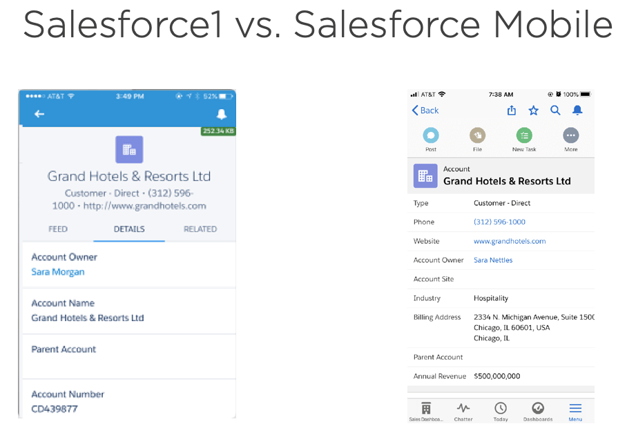
Image comparison of Salesforce1 (left) vs New Salesforce Mobile App (right)
Right away you should have noticed that the details view includes more fields and this is primarily because of the denser view with labels to the left and less space between fields. This was a feature introduced for Lightning Experience to improve usability.
There are other big features like:
Favoriting and Search icon links in the top menu bar
There is also a really cool download icon that allows authorized users to send links to other authorized users.
And the menu navigation has changed quite a bit and now mirrors what is found in Lightning Experience
Intuitive Navigation for Salesforce Mobile that mirrors Lightning Experience
There are also some Lightning App Builder improvements that let you preview pages better and use filters to set component visibility.
Set Component Visibility in Lightning App Builder
Using the Salesforce Mobile App QuickStart Page
There will be some steps Salesforce Administrators/Developers will need to take to support the transition to the new Salesforce Mobile App. To assist with that process, Salesforce has provided a new link in Setup called, New Salesforce Mobile App Quickstart.
The QuickStart includes a section called “Enable Your Customizations for Mobile” and in it is the following:
Run the Salesforce Optimizer for Mobile Lightning Pages Report (Beta) – Mostly includes recommendations for how you can fine-tune pages/apps for mobile. Once generated, a copy will be available in Files.
Update Your Lightning Apps for Mobile – Adds the phone form factor to apps. You can also do this manually through App Manager.
Update Your Pages for Mobile – Adds the phone form factor to desktop-assigned pages. You can also do this manually though Lightning App Builder.
Wrapping up the Course
The key points I hope you take away from the course are:
Don’t be afraid to embrace Aura components, even if you are a junior developer, a Salesforce Admin or a developer that has only worked with Visualforce. Simple Aura components are not difficult and can really improve the Lightning Experience for your customers.
Embrace the new modern tools that Salesforce offers and which this course goes over in depth. Even though you can create Aura components just using Developer Console, I strongly recommend that you embrace the modern toolset and Visual Studio Code. This will also help you to transition to creating Lightning Web Components, which can only be created with these tools.
When using Apex, always consider security since CRUD and FLS security is not automatically enforced.
However, if you can utilize the Base Lightning Components that do not use Apex, consider using them. It means you will not have to write Apex or Apex Unit tests, or worry about security.
Always consider the Usability of your components by using the Design Resources and making the components as flexible as possible.
Keep learning and pass what you learn onto others in the Salesforce community.
All of the code shown in the course, can be accessed through the following GitHub repo.
And if you are interested in going deeper with Aura components, check out my other intermediate Pluralsight course about Lightning Component Best Practices.
The course should be released soon. Tune in here for an announcement.
This will be the fourth of a series of posts I will be doing over the next few weeks. This particular post will cover working with the Record Form Base Lightning Component. The series will all lead up to the introduction of my new course titled, “Customizing Salesforce with Lightning Aura Components” from Pluralsight. This course is a total re-write of my most popular course, “Customizing Salesforce with Lightning Components: Getting Started“, which was released back in early 2017. It will focus on using the new modern toolset that Salesforce offers as part of Salesforce DX.
Working with Record Forms
The recordEditForm and recordViewForm components have been around for a while, but the recordForm component was introduced in Summer 18 and was a big improvement. In fact, I was so impressed with this component, I wrote about it on this blog.
The recordForm component represents the best of two other components and essentially merges them into one. This means you will need to write less JavaScript code in the form of handlers, such as onload and onsubmit because the new component will handle these automatically.
Along with less markup, since you will not have to use lightning:input or lightning:output, along with cancel and submit buttons. They are provided for you automatically. And finally, the recordForm component is exposable to more platforms, which at this time includes Lightning Experience, Lightning Communities, Salesforce Mobile App, along with Lightning Out combined with Visualforce.
And the Drawbacks? Well, it is slightly less flexible and as of now, there is a known issue involving validation that I hope you consider voting for (since that is the only way Salesforce will fix it).
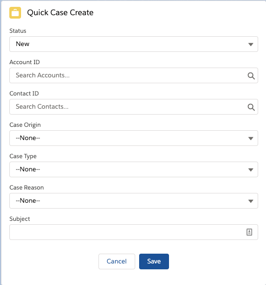
Creating a New Quick Case Component
In this section, I will show you how to build a component that let’s users quickly create a new case. The end result will be a component like this:
Quick Case Create Component
This component will use the recordForm base lightning component. Here is the code for the markup:
And here is the code for the client-side controller. Note that it includes a commented method that would handle validation, since the component unfortunately does not do this (at this time – refer to issue above). I don’t really consider this a workaround, since the whole purpose of the component was to eliminate the need for the additional code. I personally think Salesforce needs to fix it, and hope you agree.
({
    handleSuccess : function(cmp, event, helper) {
           cmp.find('notifLib').showToast({
            "variant": "success",
            "title": "Case Created",
            "message": "Record ID: " + event.getParam("id")
        });
    }
    // },
    // handleValidation : function(cmp, event, helper) {
    //     // NOTE: This method will handle validation if you specify which field to check for specifically, which is
    //     //  not a good workaround since the component should handle this for you without the need to write
    //     //  all this unecessary code (especially since the whole point of the component is to lessen the
    //     //  amount of code that needs to be written). That is why it was not mentioned in the actual course.
    //     var evtFields = event.getParam("fields");
    //     var reqField = 'Origin';
    //     if (evtFields.hasOwnProperty(reqField)) {
    //         event.preventDefault();  //Stops the record from being created
    //         cmp.find('notifLib').showToast({
    //             "variant": "error",
    //             "header": "Error was encountered",
    //             "message": "The following field is required: " + reqField
    //         });
    //     }


})
The code includes the notifications base lightning component. This is used to alert the user with a toast message when the case was added successfully.
Creating Quick Actions
In addition to including this component on the Sales Home page, I exposed it as a quick action and then created a global action using the following steps in Setup.
In Quick Find, type “global” and select Global Actions.
Click New Action.
Select “Lightning Component” as the Action Type.
Select the quickCase component from the drop down list.
Enter a label as “Quick Case Create” and tab to next line.
Click Save to Finish.
After creating the global action, you still need to add the new action to the Publishers layout, which you do using the following steps:
In Quick Find, type “Publisher” and select Publisher Layout.
Click Edit to modify the default layout.
Select “Mobile and Quick Actions”.
Scroll down to the section for Salesforce Mobile and click the override the predefined actions link.
Drag the Quick Case Create action onto the section.
Click Save to finish.
In the next and final post, I will go over the newly redesigned Salesforce Mobile App.
This will be the third of a series of posts I will be doing over the next few weeks. This particular post will cover working with Salesforce Data. The series will all lead up to the introduction of my new course titled, “Customizing Salesforce with Lightning Aura Components” from Pluralsight. This course is a total re-write of my most popular course, “Customizing Salesforce with Lightning Components: Getting Started“, which was released back in 2017. It will focus on using the new modern toolset that Salesforce offers as part of Salesforce DX.
Working with Controllers
In the last post, I walked you through creating the updateCellNumber Aura component in Visual Studio Code. I also stepped you through how to add a design file so that the placeholder value was easily modifiable in Lightning App Builder.
So far this component will only show a windows alert when the submit button is pressed. I am going to show you how to change that and have it update the Salesforce database instead.
Lightning Components have two ways of dealing with Salesforce data:
In this post, I will only covering the second method of using Apex to write server-side code.
Working with Apex and DML
Apex is strongly-typed object-oriented proprietary language developed by Salesforce. Since Salesforce is a multi-tenanted environment, Apex is subject to limits.
DML or Data Manipulation Language is what Salesforce uses to insert, update or delete a Salesforce record. To change the updateCellNumber component so that it writes to the Salesforce database, I will need to add a Class that uses both Apex and DML. The class will be named updateCellNumberApex (so that it is not named the same as the client-side JavaScript controller). Any server-side methods used by Lightning components must have the @AuraEnabled annotation. They also must be public and static. The code for the class will be as follows:
public with sharing class updateCellNumberApex {
    @AuraEnabled()
    public static void CellNumberUpdate(String cellNumber) {
        List<User> users = [SELECT MobilePhone FROM User where
                            Id =: UserInfo.getUserId()];

        if ( users.size() > 0 ) {
            users[0].MobilePhone = cellNumber;
            update users;
        }
    }
}
Once the class has been added, I will need to modify the component markup for updateCellNumber so that it is linked to this class. I do that by adding the following attribute to the aura:component tag, like this:
I will then need to switch to the client-side JavaScript controller and start by removing the code that produced a windows alert and replace it with the following:
var cellNumber = cmp.find("phone").get("v.value");
var action = cmp.get("c.CellNumberUpdate");
action.setParams({ "cellNumber" : cellNumber });
action.setCallback(this, function(response) {
    var state = response.getState();
    if (state === "SUCCESS") {
         alert(state);
     }
});
$A.enqueueAction(action);
Creating a New Open Cases Component
This component will display a list of open cases and will be named openCases. The final component will look like the following:
Open Cases Configureable Component
This Aura component will utilize the lightning:datatable base lightning component. Here is the code for the component markup:
The first part of this code is used to define the columns that will be used in the datatable. Notice that the first one is of the type url and that it has an additional definition for the typeAttributes. This is because this column will not only display the case subject, but will include a link to the case detail record.
The callback function will get whatever records are returned and then loop through those records and set the linkName so that it references the Cases record Id.
This component will utilize an Apex controller named getOpenCasesApex. It includes code needed to check for the appropriate FLS and CRUD level security. It also includes cacheable=true for the @AuraEnabled annotation in order to take advantage of caching for performance.
public with sharing class getOpenCasesApex {
    @AuraEnabled(cacheable=true)
    public static List<Case> getOpenCases(Integer numRecords) {
        // Code needed to check for proper access
        String [] caseFields = new String[] {'Id','Type','Reason','Subject','Status'};

        Map<String,Schema.SObjectField> caseMap = Schema.SObjectType.Case.fields.getMap();
        for (String fieldToCheck : caseFields) {
            if( !caseMap.get(fieldToCheck).getDescribe().isAccessible()) {
                throw new System.NoAccessException();
            }
        }

        List<Case> caseList = [SELECT Id,Type,Reason,Subject,Status FROM Case
        WHERE IsClosed = false
        LIMIT : numRecords];

        return caseList;
    }

}
And finally, it includes a numRecords input parameter, which is passed in form the value set when the component is configured in Lightning App Builder. The associated design file for this component is as follows:
<design:component label="Configurable Open Cases Component">
    <design:Attribute name="numRecords" label="Number of Records Returned" placeholder="10" />
</design:component>
In the next post, I will go over how to design components that do not require an Apex controller.
This will be the second of a series of posts I will be doing over the next few weeks. They will all lead up to the introduction of my new course titled, “Customizing Salesforce with Lightning Aura Components” from Pluralsight. This course is a total re-write of my most popular course, “Customizing Salesforce with Lightning Components: Getting Started“, which was released back in 2017. It will focus on using the new modern toolset that Salesforce offers as part of Salesforce DX.
Using an Interactive Development Environment (IDE)
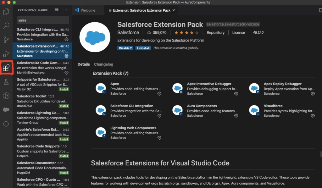
For most modern web developers, their Interactive Development Environment (IDE) is a key to their success. For Salesforce developers, the best choice for an IDE is the Salesforce Extensions for Visual Studio Code.
If you have been a Salesforce developer for a while, then this may be new to you. You may be familiar with the Force.com IDE or Interactive Development Environment for Eclipse, which is incidentally not being supported by Salesforce any more.
Salesforce Extension Pack for VS Code
Getting Setup with an IDE
To use the IDE, you will first need to install the latest version of Visual Studio Code. After this has been installed, you can open it up and click the extensions icon on the left toolbar.
Install Salesforce Extension Pack by clicking Extensions Icon
You will also need to install the Salesforce Command Line Interface (CLI). This powerful command line interface allows you to do several things with your Salesforce org, such as:
Build and load source code (such as Aura components, Apex classes, Lightning Web Components and).
Export data from any Salesforce org and import it into your scratch org, which is a temporary org that has no data loaded by default.
Execute both Apex server-side and client-side JavaScript tests.
Once you get used to working with the Salesforce Extensions, you might want to check out the GitHub repo, since it is open source. You can get a lot of information about the extensions on the ReadMe page, as well and browse the useful Wiki and Issues tabs.
Understanding Salesforce DX (SFDX)
Salesforce DX represents a whole new set of developer tools. They represent a source-driven development model, which is considered more modern. It is all built around the CLI, which you just learned about. Most importantly it represents a new way of Salesforce development now known as “Packaging Development”.
Prior to packaging development, the only way developers had to deploy their code was to package it up in a Sandbox org and then deploy it to production. This made the salesforce org the “source of truth”, as developers like to call it. But the new model moves the source of truth from the org to a version control system, like Git.
Before you can create any Aura components in VS Code, you will need to do the following things first:
Authorize a DevHub org using either the command palette or the sfdx force:auth:web:login CLI command.
Create a Salesforce project using either the command palette or the sfdx force:project:create CLI command.
Create a scratch org using either the command palette or the sfdx force:org:create CLI command.
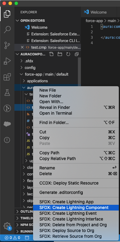
Creating an Aura Component in Visual Studio (VS) Code
After you have authorized your DevHub and created a project, you can create an Aura component, by browsing to the Aura folder, right-clicking and selecting “SFDX: Create Lightning Component”.
Creating Aura Component in VS Code
Here is the markup code for a very basic component that can be used to update a users mobile phone number.
And here is the JavaScript for the controller , in which the component will begin by only being able to create a windows alter that displays the number entered when the user clicks Submit.
The main thing you will need in order to expose your new component to Lightning App Builder is the following attributes on the required aura:component tag:
But in order to make the component more usable to Admins that might build Lightning Pages using these components, it is a good idea to always include a design resource, such as this:
You can then save all your changes and push them to the scratch org using either the command palette or the sfdx force:source:push CLI command. You will also need to open the scratch org using either the command palette or the sfdx force:org:open CLI command.
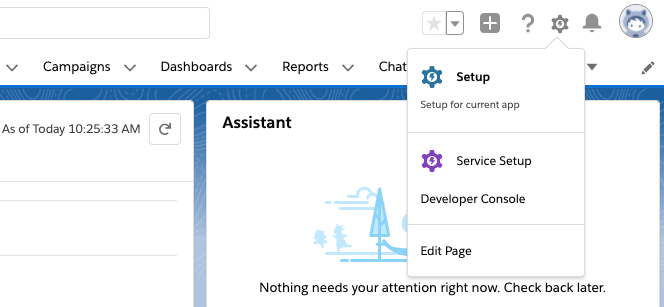
One the org is open, to add the new component to the Sales home page, use App Launcher to go to the Sales app and then click the gear icon and select Edit Page.
Edit Page is used to access Lightning App Builder
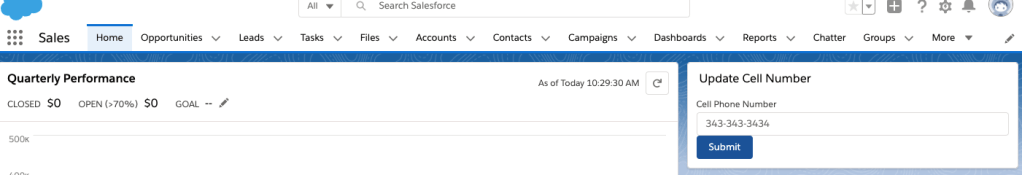
You can then just scroll down the list of components until you get to the custom ones and drag the Update Cell Number one onto the design surface.
To finish you just need to save and activate the changes. You can then use the Back button to go back to the Sales home page and see the final component.
Update Cell Number Component, so far
In the next post, this component will be improved on and tied to the Salesforce database.
This will be the first of a series of posts I will be doing over the next few weeks. They will all lead up to the introduction of my new course titled, “Customizing Salesforce with Lightning Aura Components” from Pluralsight. This course is a total re-write of my most popular course (so far), “Customizing Salesforce with Lightning Components: Getting Started“, which was released back in 2017. It will focus on using the new modern toolset that Salesforce offers as part of Salesforce DX.
Understanding the Lightning Component Framework
Lightning components (now called Aura components) were introduced in 2014. At that time, the web standards that existed offered only a limited amount of what developers needed and that is why Salesforce built them on top of the Aura Framework. It was basically, to compensate for what the standards lacked.
Flash forward to 2019 and a LOT has changed in the web development world. That is why in 2019, Salesforce announced the release of Lightning Web Components (LWC’s). It was also at that time that the original Lightning Components were renamed to Aura Components. They co-exist and are completely interoperable with LWC’s.
Who Should be Building Aura Components?
It probably will not surprise you to know that Salesforce developers are perfect for this, but what you might not realize is that so are junior Salesforce developers.
Senior or Junior Salesforce Developers
Another group you may not think of is Salesforce Administrators. You see, Aura components are way simpler to create then Lightning Web Components. Yes, they do still require the developer to know a little about HTML and JavaScript, but since the introduction of Lightning components back in 2014, they have gotten a lot simpler to work with. So, as long as the Admin is seasoned and may even consider themselves as a Super Admin, then I think they too can embrace creating Aura components.
Salesforce Super Admins
Where Can Aura Components Be Used?
Lightning pages
This includes App pages, Home and Record Pages, and even a new Embedded Service Page. The embedded service page will not be covered in this course, but the app and home pages will.
Wizard from Lightning App Builder
salesforce mobile app
In late 2019, Salesforce launched a new and completely redesigned Salesforce Mobile App. You can learn more about it by visiting the New Salesforce Mobile App Quickstart in Setup. This will be covered in the final module on “Creating Components for Salesforce Mobile”.
Access the New Salesforce Mobile App QuickStart from Setup
Other places
These other areas are beyond the scope of this course, but just so you are aware, there is also:
Quick Actions
Stand-alone apps
Inside Visualforce pages
On other platforms such as Heroku, using Lightning Out
Anatomy of an Aura Component Bundle
An Aura component can be made up of several physical files that reside in what is known as a component bundle. Even though there are 8 files that can make up a component bundle, most simple components will only need to access a couple:
Component or Markup file – Uses a .cmp file extension and is a required file and there can only be one per bundle. All markup must be encased in an <aura:component> tag and can include references to other components.
Controller or JavaScript file – Uses a .js file extension and will contain all the client-side methods needed to handle events in your component.
Creating an Aura Component Bundle
The easiest way to create an Aura component is using the online Developer Console. This will be covered only once in this first module. The rest of the course will cover creating bundles using the new modern toolsets.
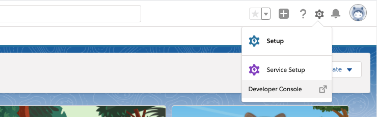
You can access the Developer Console by logging into a Developer org, click the gear icon and select Developer Console.
Access the online Developer Console
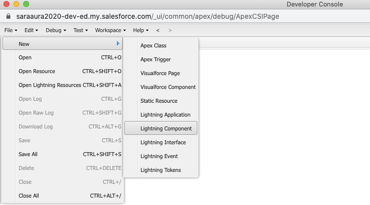
This will launch a new window and from here, you can go to File -> New -> Lightning Component.
Create a new Lightning Component in Developer Console
The initial component I will show viewers how to build is very simple and will be used by Salespeople to update their cell number. From the New Lightning Bundle dialog, you only need to enter the name “updateCellNumber” and select the Lightning Tab and Lightning Page checkboxes in Component Configuration. And finally click Submit.
Create new Lightning Bundle in Developer Console
The component markup will be very simple to begin with and will include 3 Lightning Base Components. as the course progresses, this component, along with others will be expanded upon.
I am VERY happy to announce that I am very close to releasing a new Pluralsight course called “Customizing Salesforce with Lightning Aura Components”. Well, kind of a new course.
Upcoming New Pluralsight Course
It is a total re-write of my most popular course (so far), “Customizing Salesforce with Lightning Components: Getting Started“, which was released back in 2017. That was right before Salesforce DX was released and all the other modern developer tools that Salesforce now promotes (for very good reasons).
In this course, all those great shiny new tools will be used to build very simple Aura Lightning Components, as they are now called. The original course used the online Developer Console, which is what Trailhead uses in all their content about Aura Components. On Trailhead, the new tools are only used for Lightning Web Components.
So, if you want to learn about building Aura Components, while also embracing the new modern toolset, this course is perfect for you. And if you want to learn about Lightning Web Components (LWC’s), then you can check out the “Building Your First Lightning Web Component (LWC) for Salesforce” course that I released earlier this year.
Starting next week, I will be releasing a series of weekly blog posts that will feature what content will be covered in each Pluralsight module, followed by an announcement of the courses release.


 saramorgan.net