Post 2 – Customizing Salesforce with Lightning Aura Components series

This will be the second of a series of posts I will be doing over the next few weeks. They will all lead up to the introduction of my new course titled, “Customizing Salesforce with Lightning Aura Components” from Pluralsight. This course is a total re-write of my most popular course, “Customizing Salesforce with Lightning Components: Getting Started“, which was released back in 2017. It will focus on using the new modern toolset that Salesforce offers as part of Salesforce DX.

Using an Interactive Development Environment (IDE)

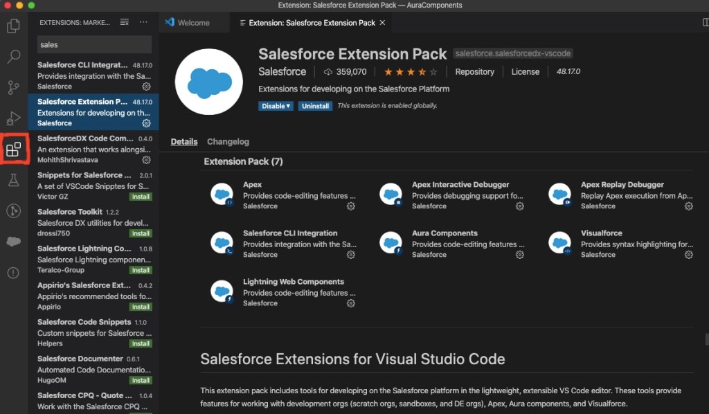
For most modern web developers, their Interactive Development Environment (IDE) is a key to their success. For Salesforce developers, the best choice for an IDE is the Salesforce Extensions for Visual Studio Code.

If you have been a Salesforce developer for a while, then this may be new to you. You may be familiar with the Force.com IDE or Interactive Development Environment for Eclipse, which is incidentally not being supported by Salesforce any more.

Salesforce Extension Pack for VS Code

Getting Setup with an IDE

To use the IDE, you will first need to install the latest version of Visual Studio Code. After this has been installed, you can open it up and click the extensions icon on the left toolbar.

Install Salesforce Extension Pack by clicking Extensions Icon

You will also need to install the Salesforce Command Line Interface (CLI). This powerful command line interface allows you to do several things with your Salesforce org, such as:

  • Build and load source code (such as Aura components, Apex classes, Lightning Web Components and).
  • Export data from any Salesforce org and import it into your scratch org, which is a temporary org that has no data loaded by default.
  • Execute both Apex server-side and client-side JavaScript tests.

Once you get used to working with the Salesforce Extensions, you might want to check out the GitHub repo, since it is open source. You can get a lot of information about the extensions on the ReadMe page, as well and browse the useful Wiki and Issues tabs.

Understanding Salesforce DX (SFDX)

Salesforce DX represents a whole new set of developer tools. They represent a source-driven development model, which is considered more modern. It is all built around the CLI, which you just learned about. Most importantly it represents a new way of Salesforce development now known as “Packaging Development”.

Prior to packaging development, the only way developers had to deploy their code was to package it up in a Sandbox org and then deploy it to production. This made the salesforce org the “source of truth”, as developers like to call it. But the new model moves the source of truth from the org to a version control system, like Git.

Before you can create any Aura components in VS Code, you will need to do the following things first:

  1. Authorize a DevHub org using either the command palette or the sfdx force:auth:web:login CLI command.
  2. Create a Salesforce project using either the command palette or the sfdx force:project:create CLI command.
  3. Create a scratch org using either the command palette or the sfdx force:org:create CLI command.

Creating an Aura Component in Visual Studio (VS) Code

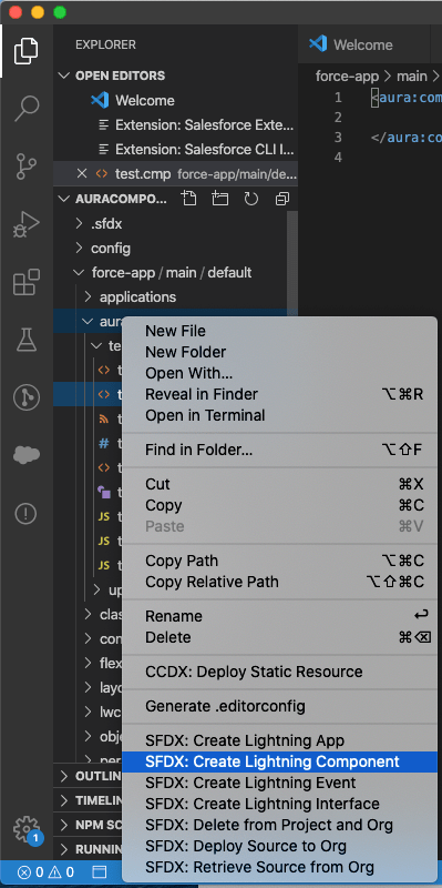
After you have authorized your DevHub and created a project, you can create an Aura component, by browsing to the Aura folder, right-clicking and selecting “SFDX: Create Lightning Component”.

Creating Aura Component in VS Code

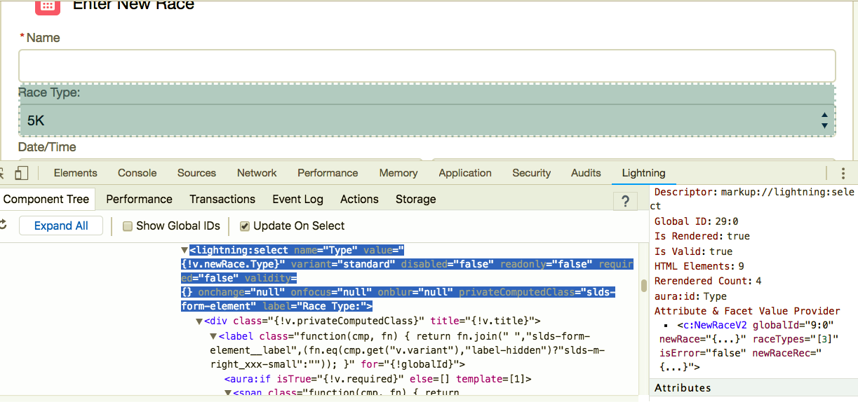
Here is the markup code for a very basic component that can be used to update a users mobile phone number.

<aura:component implements="force:appHostable,flexipage:availableForAllPageTypes" access="global" >
	<lightning:card  title="Update Cell Number">
        <p class="slds-p-horizontal_small">
            <lightning:input aura:id="phone" type="tel" label="Cell Phone Number" name="phone" placeholder="343-343-3434" pattern="[0-9]{3}-[0-9]{3}-[0-9]{4}"/>
	    <lightning:button variant="brand" label="Submit" title="Submit" onclick="{! c.handleClick }" />        
        </p>
    </lightning:card>  
    
</aura:component>

And here is the JavaScript for the controller , in which the component will begin by only being able to create a windows alter that displays the number entered when the user clicks Submit.

handleClick : function (cmp, event, helper) {
        alert('phone: ' + cmp.find("phone").get("v.value"));
}

Exposing Aura Components to Lightning App Builder

The main thing you will need in order to expose your new component to Lightning App Builder is the following attributes on the required aura:component tag:

<aura:component implements="force:appHostable,flexipage:availableForAllPageTypes" access="global" >

But in order to make the component more usable to Admins that might build Lightning Pages using these components, it is a good idea to always include a design resource, such as this:

<design:component label="Update Cell Number">
    <design:Attribute name="placeholder" label="Placeholder" placeholder="343-343-3434" />
</design:component>

This will mean that you will also have to make a change to the component markup to add a new Aura attribute such as this:

<aura:attribute name="placeholder" type="String" default="343-343-3434"/>

And you will need to make another change to the lightning:input base lightning component, in which the expression syntax is used, such as this:

<lightning:input aura:id="phone" type="tel" label="Cell Phone Number" name="phone" placeholder="{!v.placeholder}" pattern="[0-9]{3}-[0-9]{3}-[0-9]{4}"/>

You can then save all your changes and push them to the scratch org using either the command palette or the sfdx force:source:push CLI command. You will also need to open the scratch org using either the command palette or the sfdx force:org:open CLI command.

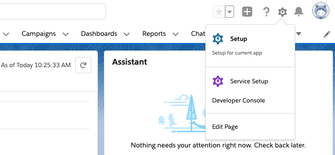
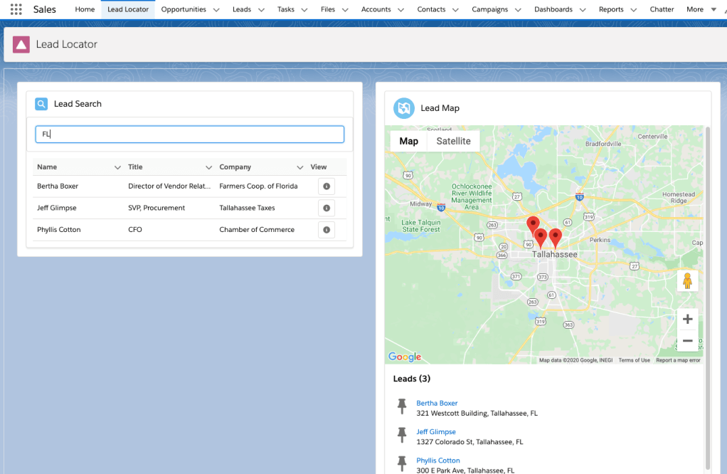
One the org is open, to add the new component to the Sales home page, use App Launcher to go to the Sales app and then click the gear icon and select Edit Page.

Edit Page is used to access Lightning App Builder

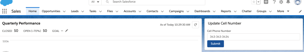
You can then just scroll down the list of components until you get to the custom ones and drag the Update Cell Number one onto the design surface.

To finish you just need to save and activate the changes. You can then use the Back button to go back to the Sales home page and see the final component.

Update Cell Number Component, so far

In the next post, this component will be improved on and tied to the Salesforce database.

Stay Tuned…

Building Your First Lightning Web Component for Salesforce Pluralsight Course is Live!!!

I am so excited to finally announce that my new Pluralsight course, “Building Your First Lightning Web Component for Salesforce” course is Live!

New Pluralisght course "Building Your First Lightning Web Component for Salesforce"

The development of this course was a labor of love for me and I have to admit something I worked so hard on. I would not compromise the quality for anything (including the three deadlines I missed). Luckily, I was working with some of the best editors in the world (huge shout out to Bentley Lignell, Stacy Sohn and Austin Allen).

As for the course, it covers the following:

  • LWC Benefits and what are Web Components
  • Setting up you development environment with Salesforce, Visual Studio Code and Salesforce DX
  • Component Design using Custom DOM events
  • Working with Salesforce Data using the Wire Adapter and Debugging with Chrome Developer Tools
  • Converting Aura components and lessons I learned
  • Testing your JavaScript with Jest

In the course, we will be building an application that will look like this:

Lead Locator LWC app

If you are looking for the final code created in this course, you can find it here.

For anyone that might not be a Pluralsight subscriber yet, here is a link to a free 10-day trial.

And finally, please feel free to send me your feedback on the course. Good or bad. I appreciate it all because it helps me to develop better content that meets your needs.

Post 3 – Building Your First Lightning Web Component for Salesforce Series

This will be the third of a series of posts I will be doing over the next few weeks. They will all lead up to the introduction of my new course titled, “Building Your First Lightning Web Component for Salesforce” from Pluralsight. These posts will contain code snippets of the code used in the course, but will not include all the tips and best practices about using SFDX, along with the way I personally approach teaching in my video courses.

You also have to realize that the solution is built in stages and so the code you see here is not exactly what you will see by the end of the next module. For all that, you will just have to wait and watch the course, which I hope you do.

And Finally, I know there has been a big delay between the first two posts and these remaining posts, but I promise you that the delay will have been worth the wait. I am VERY proud of how this course is turning out and feel like it will be my best yet. 

Component Design

LWC’s are similar to Aura components in the fact that you should consider each component as an application building block. And just like with Aura components, most LWC’s will contain many smaller, nested components. The biggest difference is that the communication patterns between Aura components and LWC’s is VERY different.

LWC Nested Composition

NestedComposition

In this course, we will actually be creating multiple LWC components that demonstrate a nested pattern. At the outermost layer we will have a Lightning App Page and inside of that will be an owner or container component. The owner can contain other components, which also contain other components. What is happening here is that we have a parent-child relationship going on and that is very important is determining how data is passed between LWC components.

Creating the Owner Component

At first this component (which we will name myFirstLWC) will just contain placeholder text for where the two components it will contain will ultimately reside. Here is the HTML we will use for now:

<template>
    <div class="c-container">
            <lightning-layout multiple-rows="true">
                <lightning-layout-item padding="around-small" size="12">
                    <lightning-layout>
                        <lightning-layout-item padding="around-small" size="6">
                            <div class="slds-box slds-theme_default">
                                <h2>TO DO: Add List LWC Component here</h2>
                            </div>
                        </lightning-layout-item>
                        <lightning-layout-item padding="around-small" size="6">
                            <div class="page-section page-main">
                                <h2>TO DO: Add Map LWC Component here</h2>
                            </div>
                        </lightning-layout-item>
                    </lightning-layout>
                </lightning-layout-item>
            </lightning-layout>
        </div>
</template>

You will also need to modify the metadata file so it exposes this component (but ONLY this component since it is the owner) to the Lightning App Builder.

<?xml version="1.0" encoding="UTF-8"?>
<LightningComponentBundle xmlns="http://soap.sforce.com/2006/04/metadata" fqn="MyFirstLWC">
    <apiVersion>47.0</apiVersion>
    <isExposed>true</isExposed>
    <targets>     
      <target>lightning__RecordPage</target>
      <target>lightning__AppPage</target>
      <target>lightning__HomePage</target>
  </targets>
</LightningComponentBundle>

  1. Type “Lightning App” in Quick Find and select Lightning App Builder.
  2. Click New to start the Wizard.
  3. Leave the default on App Page and click Next.
  4. Enter the label “Lead Locator” and click Next.
  5. Select One Region and click Finish.
  6. In the Builder, scroll down to to the Custom List and drag the myFirstLWC onto the design surface.
  7. Click Save.
  8. Click Activate when prompted.
  9. From the Activation Wizard, accept the defaults, and select the Lightning Experience tab.
  10. Select Sales and click Add Page to app.
  11. Click Save.
  12. Click Back to return to Setup.
  13. Click the App Launcher and select the Sales app.You should see the Lead Locator app and you should select it to see your very basic app so far.

Creating the LeadList Component

The Here is the HTML for our leadList component. Notice that it contains two other nested components. One is a Lightning base component called lightning-input and the other is a custom one yet to be created called lead-list-item.

<template>
    <lightning-card title="Lead Search" icon-name="standard:search" class="slds--around_medium">
        <div class="slds-box slds-theme_default">
            <lightning-input
                label="Search Term"
                variant="label-hidden"
                placeholder="Search by name, phone, website, or address"
                type="text"
                value={searchTerm}
                onchange={handleSearchTermChange}>
            </lightning-input>
            <h3>Leads for {searchTerm}</h3>
        </div>
        <div class="slds-m-around_small">
            <template if:true={leads}>
                <template for:each={leads} for:item="lead">
                    <c-lead-list-item key={lead.Id} lead={lead} ></c-lead-list-item> 
                </template>
            </template>
        </div>
    </lightning-card>
</template>

Since this module is only about Composition and not about data, the JavaScript for this component will just contain some static JSON code to represent the lead data. It will also use the Track decorators for the leads array and the searchTerm, which allow you to keep track of a properties value when it is re-rendered.

Most importantly, it will follow best practices and use the simplest way to communicate with events by using a standard CustomEvent called newsearch.

import { LightningElement, track} from 'lwc';

export default class LeadList extends (LightningElement) {
    @track leads =[];
    @track searchTerm;

    handleSearchTermChange(event) {
        this.searchTerm = event.target.value;
        const selectedEvent = new CustomEvent('newsearch', {detail: this.searchTerm});
        this.dispatchEvent(selectedEvent);
    }

    leads = [
        {
            "Id": "LeadRef1",
            "Name": "Bertha Boxer",
            "Title": "Director of Vendor Relations",
            "Company": "Farmers Coop. of Florida",
            "Street": "321 Westcott Building",
            "City": "Tallahassee",
            "State": "FL",
            "PostalCode": "32306"
        },
        {
            "Id": "LeadRef2",
            "Name": "Phyllis Cotton",
            "Title": "CFO",
            "Company": "Chamber of Commerce",
            "Street": "300 E Park Ave",
            "City": "Tallahassee",
            "State": "FL",
            "PostalCode": "32301"
        },
        {
            "Id": "LeadRef3",
            "Name": "Jeff Glimpse",
            "Title": "SVP, Procurement",
            "Company": "Tallahassee Taxes",
            "Street": "1327 Colorado St",
            "City": "Tallahassee",
            "State": "FL",
            "PostalCode": "32304"
        }
    ];

}

 Modifying the Owner Component

Since we added a CustomEvent to the leadList component, we will need to add some JavaScript to the owner component, myFirstLWC that will handle this event.

import { LightningElement, track } from 'lwc';

export default class MyFirstLWC extends LightningElement {
    @track searchTerm;

    handleNewSearch(event) {
        this.searchTerm = event.target.value; 
    }
}

We will also need to modify the HTML so that we remove the placeholder text for the leadList component. Notice though how it is named. All LWC’s will be rendered with the c namespace, followed by a hyphen and then the component name, which is also separated by a hyphen. LWC knows that the leadList component is two words because we used kebab or camel case when naming it. This is a commonly used HTML standard and it means that the component must start with a lowercase letter and the other letter must be capitalized with no spaces in between, which is how we named the leadList component.

<c-lead-list onnewsearch={handleNewSearch}></c-lead-list>

Creating the leadListItem Component

This is just a very basic component that will display the results of the search. Not much to it for now.

<template>
    <lightning-layout vertical-align="center">
        <lightning-layout-item padding="around-small">
            <p>{lead.Name}</p>
        </lightning-layout-item>
        <lightning-layout-item padding="around-small">
            <p>{lead.Title}</p>
        </lightning-layout-item>
        <lightning-layout-item padding="around-small">
            <p>{lead.Company}</p>
        </lightning-layout-item>
    </lightning-layout>
</template>

And here is the JavaScript for that component. It will use the api decorator since the lead that is passed to it is a public property.

import { LightningElement, api } from 'lwc';

export default class LeadListItem extends LightningElement {
    @api lead;
}

So that is all we have for now. If you push all the code we have here and go to do a search, you should see the term you type displayed right below it, but not much else is happening yet. But stay tuned for the next post, because that is where all the magic will happen and the solution will come together.

Lightning Web Components Have Arrived!

Yesterday, I had the huge honor of being able to attend (in person) the official launch of Lightning Web Components. What a day! Only 250 people were invited to this event, and I was one of them. And for any of you that did not get a chance to tune in to the live broadcast, you can check out the recording here.

ecwialwnskatytru+ovkpa
Our fearless leader Sarah Franklin leading off the broadcast 

I know I work for Salesforce, but Lightning Web Components are simply AMAZING!!! Built on native web standards, one of the things that was shared by Dory Weiss (the VP of Engineering at nCino) was that she thought using Lightning web components was as close to future proofing as she could come for her organization.

liwvrvfksjyrroz0vo24va
Leah McGowen-Hare leading a panel of experts discussion

So what is it that makes Lightning web components (LWC’s) so amazing?

1.) Performance – Tests have already shown that LWC’s significantly out perform aura components (what used to be called Lightning components). Why are they so much faster? Well, aura components were built on the aura framework (hence the name). This adds a layer of abstraction (aka, more code that ends up getting executed). But, LWC’s are built entirely on “game changing” native web standards that are built-in to the browser. No extra code to execute.

Screen Shot 2019-01-24 at 11.10.03 AM.png

2.) Interoperability – LWC’s can be embedded inside of aura components, communicate with events and access the same underlying services. This is not an all or nothing thing. If you have already created a lot of aura components, there is no need for you to upgrade them immediately. You can take your time and target those components that are simple or having specific performance problems.

3.) Referential Integrity – LWC’s allow you to import static schema elements which gives you referential integrity. It makes your LWC’s metadata aware. This means that no one in your org can delete a field or object that is used in your JavaScript code. Boom!

4.) It’s FUN – In the words of Dave Carroll and just about every LWC pilot participant, developing LWC’s is fun! Gone are many of the pain points with developing aura components.

Ready to dive in?  Check out the following resources:

Developer Docs

Introducing Lightning Web Components

Trailhead Quick Start: Lightning Web Components

Introducing Lightning Web Components with Recipes, Patterns and Best Practices


Modern JavaScript Development – What is it and why should I care?

Are you an experienced software developer? Well, unless you have been living under a rock, you have probably heard at least once that you should learn more about JavaScript to remain relevant as a developer. You may have even heard the phrase “Modern JavaScript Development” tossed about like knowing what that means is just common knowledge. But is it? I don’t think so.

JSI am very happy to announce that a new Trailhead module I have been working on called, Modern JavaScript Development was just released. It is part of a new trail called Learn to Work with JavaScript. This trail not only features my module, but one written by the fabulous developer Evangelist, Peter Chittum that was released in September called JavaScript Skills for Salesforce Developers.

My module was written specifically for Trailblazers that only have a basic understanding of the syntax and features of JavaScript ES5. And if you don’t know what I mean by ES5, then it is also for you. Basically, if you have ever copied some JavaScript and maybe not understood everything it does, then this module is for you. Along with the one that Peter wrote.

And here are just some of the things you will learn in this module:

  • Describe the current state of JavaScript development.
  • Describe the difference between function and block scoping.
  • Recognize shorthand ES6+ syntax used to initialize variables.
  • Identify the new destructuring syntax used to separate data.
  • Identify the backtick character used to create template literals.
  • Recognize the fat arrow syntax for functions.
  • Explain why defining optional parameters in ES6+ results in cleaner code.
  • Describe the different uses for the ‘…’ operator.
  • Explain what’s different about how you create and invoke classes in ES6+.
  • Recognize the basic syntax and different importing styles used to define modules.
  • Demonstrate how asynchronous calls can be chained together using promises.
  • Demonstrate how an async function can be used to call a promise.
  • Identify the different elements used in a Jasmine testing script.
  • Create a simple Jasmine test suite and run it stand-alone.

Sound exciting? I hope so. And I hope you find the module useful. There is an awful lot that can be said about Modern JavaScript Development and ES6 specifically, but I tried to boil it down to just the most important things I thought you should be aware of.

And finally, if you want to learn even more about JavaScript and Salesforce, you should also check out Dan Appleman’s FREE Pluralsight course called Getting Started with JavaScript in Salesforce.

Not to be missed Developer Content on Trailhead

THLogoOk, I know I work for Trailhead and so I am a little bit biased, but I just have to say that we released some incredibly awesome developer-based content in September. If you are a serious Salesforce developer that has been waiting for some juicy content from Trailhead, I think you will really like what we have out right now. This post highlights my favorites.

Got Slack?

A lot of teams do and they love it. If your team does, wouldn’t it be cool if you could integrate Slack with systems in your own company? Well you can. Using webhooks, you can bring notifications and data in from other systems and build your very own Slack app. You can even use AI services to create your own intelligent Slack bot.

To get started, check out this beginner module, Slack Development Basics. Once you know the basics, you can move on to working through the Build a Welcome Bot for Slack. In that hands-on project, you will use Node SDK’s and the Slack API’s to build a welcome bot that interacts with users that signup to your channel.

What about Heroku?

If you have not been playing around with Heroku, then you are missing out. Seriously! Heroku is such an incredible platform and EVERY Salesforce developer should be looking at how they can work with it to deliver incredible online experiences.

We have two new projects that you need to check out. If you are new to Heroku, then look at Quick Start: Build a Java App on Heroku, which is a simple three step project that will get your feet wet with creating, deploying and scaling a simple Java app on Heroku.

More experienced developers wanting to see a rich end-to-end solution will want to move straight to Develop a Heroku App that Integrates with Salesforce, which walks you through installing the Dreamhouse App to Heroku and then setting up Heroku Connect so that property data is synced both ways between your Salesforce org and Heroku app. You will even see how to implement continuous delivery through Heroku Pipelines and Flow.

Need to know more about JavaScript?

Every Salesforce developer should be trying to enhance their JavaScript skills since the Lightning platform is all about JavaScript. JavaScript Skills for Salesforce Developers is just what you need to learn the key JavaScript skills that you need to take your Visualforce pages and Lightning Components to the next level.

Think you know enough about Unit Testing?

I bet you could learn some more and I know just the module to help. This new module called Unit Testing on the Lightning Platform dives deep into topics such as positive and negative testing, using a mock and a stub, as well as permission-based testing. It even covers testing JavaScript with the Lightning Testing Service.

Finish it all off with Alexa

Ready for some fun? We have a super fun project that uses a new voice platform called Violet to build an Alexa-based app that links back to your Salesforce org. Quick Start: Violet will walk you through setting up an Alexa Skill that lets you plan a game night for your friends.

Have fun!!!


Debugging Lightning Components with the Salesforce Lightning Inspector

Since Lightning Components are built with JavaScript, you can use standard browser development tools, such as the Chrome Developer Tools to debug your components. You can easily access the tools by right-clicking in your Chrome browser and clicking Inspect. You can learn more about the Dev Tools and how to debug with them from this great video here.

But, if you are really serious about debugging your Lightning components, then you need to go one step further and install the Salesforce Lightning Inspector, which is available as a Google Chrome extension. Just click the last link and select the Add to Chrome button. Once installed, you will have access to another tab in the regular Dev tools called Lightning.

Inspector

Why this tool? Because it gives you an inside peek into exactly how your Lighting Components are constructed and behaving. The Lightning Tab includes several sub tabs, which each reveal more detailed information about your component, beginning with the Component Tree.

Component Tree Tab

The Component Tree shows you a detailed tree view of the structure of your components. As opposed to the regular elements tab in Dev Tools, which only shows you the rendered version of your components, the Component tree shows you the actual components themselves and gives you information about the attributes they use.

For example, if I use the component tree to look at the Race Tracker Lightning app and expand the elements of the tree, I can click on one of the elements (such as the Race Type, which is really just a lightning:select component) and see detailed info about that component on the right.

ComponentTree.png

Notice how when I select the lightning:select component in the component tree window, that component is highlighted in the browser. Also notice on the right, I have additional information displayed about the attributes and value provider. This type of information can not only be valuable as you are debugging components, but also when learning what all is possible with your existing components. You may discover attributes here you did not even know existed.

Performance Tab

Next up is the Performance tab, which at first glance may look very similar to the regular Performance tab offered by the Dev Tools. However, the Lightning Performance tab provides information that is just specific to your Lightning components and not the Document Object Model (DOM), so you do not have to sort through stuff you are really not interested in.

To use the tab, you must first click the circle icon, which should turn to red when it is turned on. But this is not all you must do. You must also refresh your page or perform  some action and then click the graph icon to show the current Collected data. Only then will you see information such as you see below.

Performance.png

Once the chart is loaded, you can hover over areas in the timeline and narrow in on certain areas, or click on one of the components and see specific performance info about just that component. This can be especially useful when you have a slow performing Lightning page with several components. You can use the chart to visualize the performance of each component and then spot pretty easily any outliers.

Transactions Tab

The Transactions tab is similar to the Performance tab in that you must toggle the recording on before getting any useful information. But the transactions that appear here are triggered by Salesforce apps, so I do not see much use in this particular tab.

Event Log Tab

Just like with the Performance and Transactions tabs, this tab requires you to toggle on the recording and then initiate some action (like a button click) or refresh the page to see the results. You will likely be amazed once you see just how many events are firing off behind the scenes. You can easily spot whether the event was a component or an app event by looking for CMP or APP below the event. And there are buttons that let you filter for either one, as well as unhandled events.

Screen Shot 2018-07-22 at 10.22.45 PM.png

Expanding out the event will reveal very useful information such as the parameters, caller, source, duration and call stack. You can also click the Toggle Grid button to toggle on or off a diagram of the event. This can be very useful when you have a page with multiple components and you are not sure which component fired which event.

Screen Shot 2018-07-22 at 10.38.32 PM.png

Actions Tab

This is my favorite tab and one I use the most. Toggling on the recording will show you actions sorted according to whether they are pending, running, or completed. The view defaults to show all actions, but you can narrow down the list by using the filter buttons at the top. This can be useful for quickly zeroing in on an error since most pages will produce a lot of actions. For example, you can toggle off all the action types, except for error in order to just see those actions.

Screen Shot 2018-07-23 at 7.59.21 AM.png

You can see from the image above, narrowing down my list shows that I have one action that produced an error on the Race Tracker page and it was the one to get all the races. To see the error message that was returned, I can expand the action node. This will also show me the component source, which in this case is the ListRaces component.

Screen Shot 2018-07-23 at 8.05.18 AM.png

Storage Tab

The final storage tab shows you the client-side storage size of any storable actions your page may use. It will also show the specific items contained in storage, if you expand out the items.

Screen Shot 2018-07-23 at 9.27.25 AM.png

If you do not know about storable actions and want to learn more, check out this post. They are easy to use and can really improve the performance of your components.

If you found this article useful, you might want to checkout my latest course on Pluralsight titled, Lightning Component Development Best Practices.

Need Help Converting Your Classic JavaScript Buttons to Quick Actions?

In last weeks Lightning Keynote for TrailheaDX, Eric Jacobsen told everyone that an analysis done by his group showed that there are over 2 Million Javascript buttons in Salesforce Classic today.

WOW!!! That’s a lot of buttons that still need to be converted to Lightning Quick Actions.

This has been a not so fun task lingering over many Salesforce developer heads for quite some time. I imagine this one issue has been the main reason many Salesforce orgs have been hesitant to fully adopt Lightning.

So now my question to you is, “Do you think you need help converting your JavaScript buttons to Quick Actions?”

If you answered yes, then the good news is that the help is coming. Eric announced in that very same keynote that a new tool called the Lightning Configuration Converter will be available in late Spring 18.

The new tool will help you to identify those JS buttons that you still need to convert and then for some of them, will give you a simple way to convert them by using a single click. Yep! A single click!!!

Screen Shot 2018-04-08 at 5.15.28 PM

So that was the good news and now here is the bad news.  The bad news is that the tool is not quite available yet and even when it is, they are estimating that it will only convert about 20% of your buttons at first. But, it sounds like that number will possibly go up as time goes on. And let’s face it, 20% is still a lot better than 0%. So, I still think this a huge win for the Salesforce development community.

And here is some more good news. Right now what is available is a GitHub repo that contains 9 examples of commonly used JavaScript buttons and the code needed to convert those to Lightning Quick Actions. This covers some of the most common and sometimes complex scenarios where JS buttons are used, such as:

  • Showing a Dialogue
  • Redirecting to a URL conditionally
  • Performing Mass Updates

So check out the repo and wait for more news about the release of the new Lightning Configuration Converter.

Happy Converting…

New Customizing Salesforce with Lightning Components Course Released

SecondCourse.png
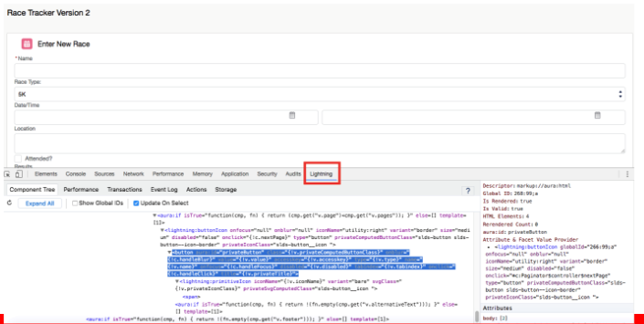
I am proud to announce that yesterday my new course for Pluralsight titled, “Customizing Salesforce with Lightning Components: Getting Started” was released.

Here is the long description:

In this course, you’ll learn how to easily customize Salesforce with the new Lightning Component framework, which includes all the tools and technologies needed to build responsive and efficient components for any device. First, you’ll cover the basics of building Lightning Components, and how to work with data using built-in components such as the Lightning Data Service. Next, you’ll explore Lightning alternatives for the traditional JavaScript buttons that so many orgs have now. Finally, you’ll learn about the most efficient way to migrate from Visualforce to Lightning. Although, many things have changed during the evolution of the Lightning Component framework, don’t worry, you’ll learn what you need to know to get up to “lightning” speed. By the end of this course, you’ll be well on your journey towards customizing your org with Lightning components.

Specific topics I cover are:

  • Base Lightning Components
  • Lightning Data Service
  • Extending SLDS
  • Lightning Actions
  • Migrating from Visualforce to Lightning

Hope you like the course. I worked really hard on it, dedicating every weekend for the past 7 months. I wanted each module to be special and I hope my efforts show.

If you see the course, I would be really interested in your feedback – good or negative. All of it helps me to create better courses.

Winter 17: Replacing JavaScript Buttons With Lightning Actions

Winter 17 hasJS introduced a whole bunch of new enhancements for Lightning and I will be blogging about a lot of them in the next few weeks, but one of my favorites is the new Lightning Actions that provide the ability to replace all those JavaScript buttons you may have littered about your org.

Ok, now anyone that has an org with more than one JavaScript button, just read that last statementdreamstime_xl_25648715 
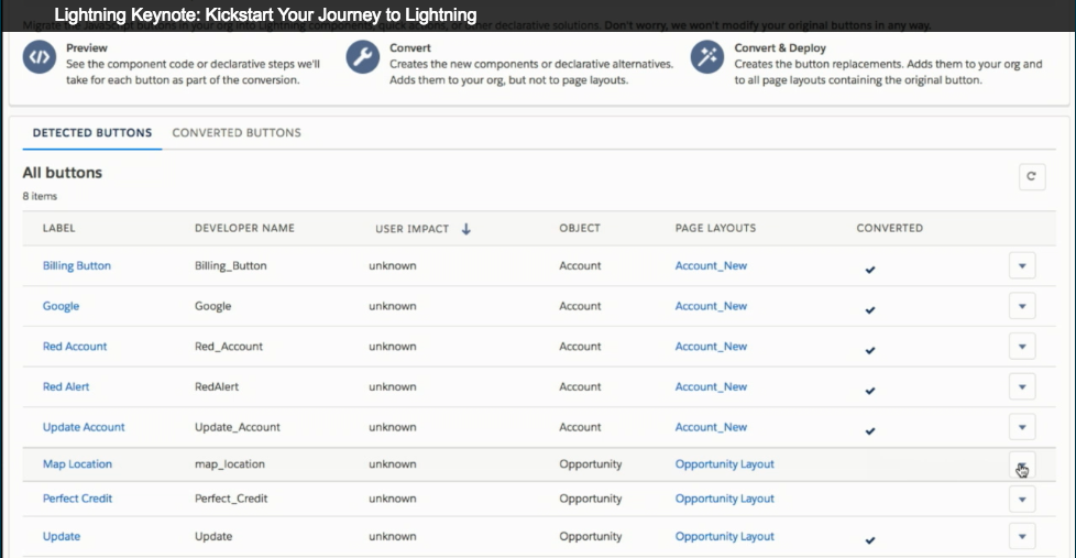
and probably thought, “Say what? I have to replace JavaScript buttons with something new? What about just migrating the existing buttons to Lightning?”

Can’t do it.

Why? Well, in three words, “Big Security Concerns

Yep. the kind that can bring an org to it’s knees and one that also can’t be resolved by providing some simple migration tool that converts existing buttons into Lightning actions automagically.

The bad news here is that you are going to have to do some real work to get all those buttons converted into Lightning actions. But, the good news is that once you do it, you will probably be very happy that you did and your org will certainly be more secure as a result.

And to help you get to that point, the Salesforce development group has started a new blog series titled, “JavaScript Buttons, Lightning and You“. This three part series will step you through what you need to know to move towards Lightning Actions. I also plan to cover this very topic as part of the new Lightning course I am working on (more on that later).

So, take some time to check out the new blog series and learn why you might be better off starting your transition to Lightning by first converting all those buttons to actions.

And stay tuned for more info about my upcoming Pluralsight course.