Below you will find a preview video for my Pluralsight course, “Communicate Between Salesforce Lightning Web Components”. This is not a course for beginners new to LWC’s or Salesforce. But, if you plan on building an app that involves multiple LWC’s and you already know the basics, then this course is for you and hopefully this preview video will convince you of that.
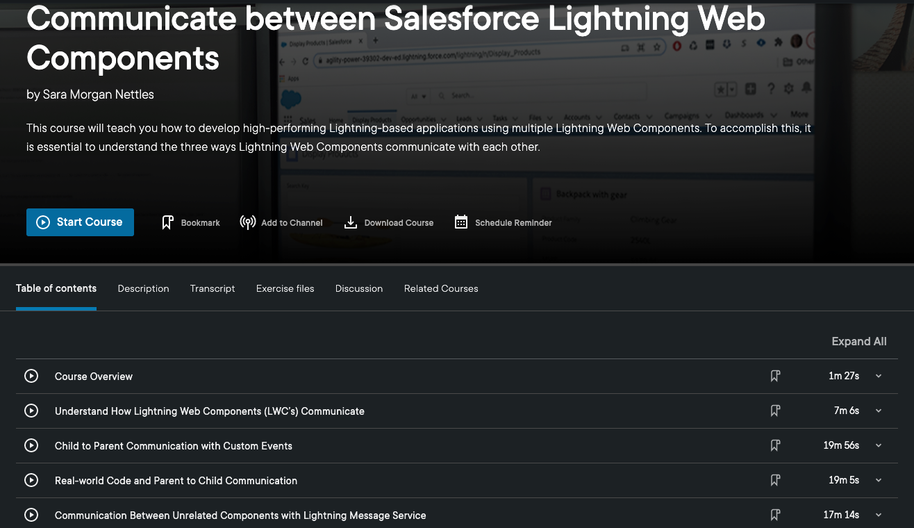
Communicate Between Salesforce Lightning Web Components
In this course you will learn how to effectively communicate between LWC’s. First you will discover the three methods used to communicate between components. Then you will learn details about each method by seeing how they work in a real-world app. By the end of the course, you will know how to build your own high-performing Lightning-based app that is assembled with Lightning Web Components. This course is focused solely on LWC communication.
Are you a Salesforce developer that has been tasked with building a complex app involving multiple Lightning Web Components (LWC’s)?
The most important thing to understand is all the ways these components can communicate. Without a solid understanding of this concept, you may struggle and inadvertently create a poor performing or error prone app.
That is why I am happy to announce that my latest Pluralsight course, “Communicate Between Salesforce Lightning Web Components” has just been released. This is not a course for beginners new to LWC’s or Salesforce. But, if you plan on building an app that involves multiple LWC’s and you already know the basics, then this course is for you.
Communicate Between Salesforce Lightning web Components
In this course you will learn how to effectively communicate between LWC’s. First you will discover the three methods used to communicate between components. Then you will learn details about each method by seeing how they work in a real-world app. By the end of the course, you will know how to build your own high-performing Lightning-based app that is assembled with Lightning Web Components. This course is focused solely on LWC communication.
I hope you find the course useful. If you do check it out and have feedback, I would love to hear it – good or bad. You can give feedback through Pluralsight or here on my blog. Either way, it would be appreciated. Thank you.
Salesforce’s Spring 21 release has brought about a lot of big changes. Some I am not so thrilled with, but one has so far been nice to see.
Sandbox Source Tracking went GA with this release. This is meant to help us poor developers keep track of all metadata changes between our local VS Code source repositories and the actual Sandbox/Scratch orgs.
In a nutshell, it appears to me that the dreaded package.xml file will be going away, eventually. This file has caused far too many problems (especially for teams of developers). Instead of having to manually track all metadata data changes, Salesforce will automatically keep those changes synchronized between your local development workspace and the org. THANK YOU Salesforce!
Now before you get too excited, this is NOT going to be an easy transition. For starters, a force:source:pull will not get you all the metadata from an org. I experienced problems just trying to do a simple demo with a scratch org this past weekend, using brand new code.
I anticipate a lot of customers are going to experience huge problems as a result of this change. This will be especially difficult for legacy customers with huge monolith orgs that have not been untangled.
But, I do believe this step is necessary to allowing all Salesforce developers to really emerge from the 90’s and start doing serious modern web development. Before you go too far with this, you need to know what you are dealing with. Start by checking out this Developer Blog article. I am sure there will be lots more Trailhead modules/videos etc to come on this.
So, this is not some “magic pill” to solve all development/deployment problems. But, it is a good first step. Looking forward to seeing problems addressed and enhancements made.
For anyone brand new to the Salesforce Lightning Web Component Framework, learning about all this can be quite challenging. Late last year I released a Pluralsight course named, “Salesforce Lighting Web Components: The Big Picture“.
This Big Picture course was designed to slow things down and give you a high-level overview of all the pieces that make up the framework. In a nutshell, Lightning Web Components can be used to build trusted and highly performant web apps that use Salesforce data to run anywhere.
In an effort to expose more developers to this powerful framework, I have put together the following promotional preview video that you can watch for free on this blog. I hope it helps give you a better and bigger picture of all that LWC’s have to offer.
Salesforce Lightning Web Components: The Big Picture
If you are brand new to Lightning Web Components, then you definitely want to begin by working through the Build Lightning Web Components trail on Trailhead. The trail several projects and modules and you do not have to work them all at once. But at the very least, you should complete the first one, Quick Start: Lighting Web Components.
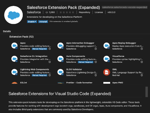
Tip # 2 – Install the Salesforce Extended Expansion Pack
Better Option is to install the Salesforce Extended Expansion Pack
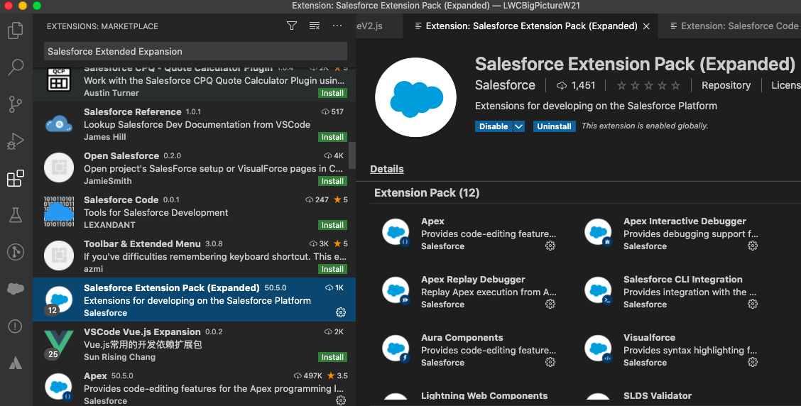
The official Salesforce docs tell you to install the Salesforce Extension Pack for Visual Studio Code. But, I suggest you also/or instead install the Salesforce Extended Expansion Pack, which you can do by Clicking the Extensions icon in the left toolbar of Visual Studio Code and then selecting Salesforce Extension Pack (Extended).
Select the Extended Expansion Pack though the Extensions icon in Visual Studio Code
This extension pack will include 4 additional JavaScript libraries that you will more than likely need. They are XML, ESLint, Prettier and Apex PMD.
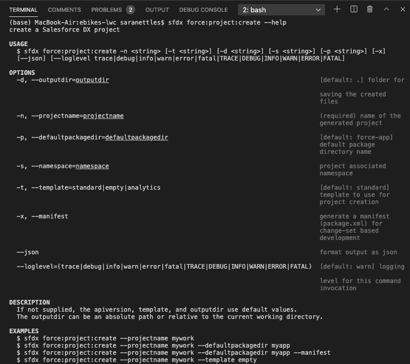
Tip # 3 – Embrace the Command Line Interface (CLI) Help
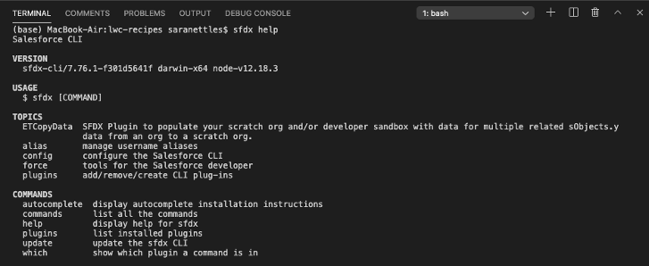
Don’t fear the CLI – Embrace it! I know that the Salesforce Extensions offers a very nifty Command Palette tool, but that does not cover everything that the CLI offers. By using the built-in help features, you not only get access to the latest docs (and that you can be rest assured of), but you can learn a lot about what the CLI Offers.
To access the help feature, just type the following sfdx help from a Terminal Window in Visual Studio Code. This will bring up results such as the following:
Access the CLI help feature from Terminal window
To drill down into one of the topics, such as the force one, use the following:
sfdx force --help
From there you can drill down as far as you need to, such as this command for accessing info about creating a Salesforce DX project:
sfdx force:project:create --help
Tip # 4 – Use Base Lightning Components Whenever Possible
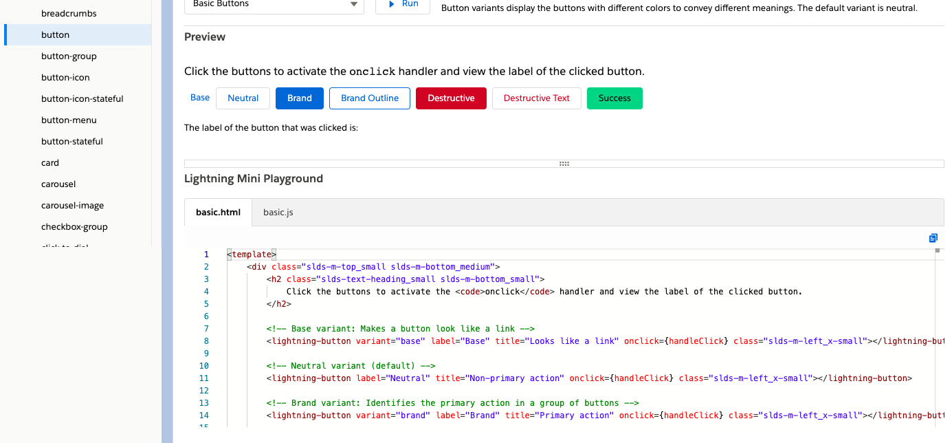
The Base Lightning Components that Salesforce offers not only make your life as a developer so much easier, they are highly performant than anything you might try to create yourself. So, you should check them all out and make sure to use them whenever possible.
The Component library offers a handy Lightning Mini Playground that you can use to access sample HTML and JavaScript directly.
The Component Library offers a handy Lightning Mini Playground feature
Tip # 5 – Reference the Code in the Sample App Gallery
The Sample App Gallery includes real-world code that were all designed by the incredible developers with the Salesforce developer relations group. They not only demonstrate new Salesforce features, but best practices for how to create Lightning web components.
As you begin the process, the most important one to checkout is the LWC Recipes one. This GitHub repo features very short code snippets that demonstrate how to perform certain key operations.
I am beyond happy to announce the release of my latest Pluralsight course, “Salesforce Lightning Web Components: The Big Picture“. This is a high-level overview of all the important things that make up this new modern and standards-based framework.
Viewers will first explore what makes up the entire Lightning Web Stack. This will include discovering the open-source Lightning Design System, which is key to the entire Lightning Experience.
Lightning Web Stack
Learners will also learn about the modern developer tools that Salesforce now offers. These tools offer developers a way to build robust and high-performing web apps. The tools should be instantly familiar to developers familiar with building modern web apps using frameworks like React or Vue.
Visual Studio Code and the Salesforce Extension Pack
When learners are finished, they should have the skills and knowledge of Lightning Web Components needed to build an adoption plan for their own Salesforce organizations.
And if you watch the course, please feel free to give me feedback. Good or bad. Thanks!
EDIT: Go here to access a promotional video I created for this course. It is a condensed 10 minute preview of the course that should give you a good idea of what it offers.
After spending quite a lot of time working with the Salesforce Extensions for Visual Studio Code and discovering many hidden gems, here is a list of my top 5 tips. Hope they help you in your development journey.
#1 – Install the Expanded Extension Pack
This VERY handy version of the regular Salesforce Extension Pack, includes not only all the core SFDX plugin’s, but all the third-party ones you might need, like Prettier, ESLint, etc.
Salesforce Expanded Extension Pack
#2 – Run Update as Often as Possible
This is perhaps the MOST important tip I will offer. Unlike the rest of Salesforce software, the SS Salesforce Extensions are updated every week. That’s right. And they are constantly adding really cool features, so if you have not run…
sfdx update
in a while, you are probably wayyyyy behind and need to do it immediately!
#3 – Use the CLI Help Feature
For all of you that depend solely on the Command Palette, you really need to start using the built-in help that is offered. Come on, the Terminal is not that scary.
Not only will you get access to some really helpful info, but you will learn a heck of a lot about the CLI in general. Start by just typing sfdx help.
Go even further down the stack, but use –help past the first level. For example, to see the help for the project create command, so the following:
sfdx force:project:create --help
Use the built-in help feature
#4 – Use Code Completion and Snippets
If you do a lot of work with Apex, then you definitely want to check out using the Code Completion and Code Snippets features. This can be really helpful when creating Apex classes or triggers (especially if you are like me and do not do it that often).
#5 – See all SFDX Commands
When you are first learning how to work with the extensions, it can be helpful to see a list of all the available commands. This is accomplished by entering the following command: sfdx commands
Whichever flavor you select, the tip in this post applies to both Aura components and the new Lightning web components.
So what does creating Admin friendly Lightning components mean?
In a nutshell, it means making your component as configureable as possible to anyone using it to assemble Lightning pages using Lightning App Builder. This is done by using a meta configuration file for LWC’s or a design resource file for Aura components.
Whichever flavor you chose, the tip in this post applies to both Aura components and the new Lightning web components.
To give you an example of how that is done for LWC’s, let’s look at the code for the eBikes sample app, which can be found here for the LWC version. This is what the HTML for that component looks like:
import { LightningElement, api, wire } from 'lwc';

// Ligthning Message Service and message channels
import { publish, subscribe, MessageContext } from 'lightning/messageService';
import PRODUCTS_FILTERED_MESSAGE from '@salesforce/messageChannel/ProductsFiltered__c';
import PRODUCT_SELECTED_MESSAGE from '@salesforce/messageChannel/ProductSelected__c';

// getProducts() method in ProductController Apex class
import getProducts from '@salesforce/apex/ProductController.getProducts';

/**
 * Container component that loads and displays a list of Product__c records.
 */
export default class ProductTileList extends LightningElement {
    /**
     * Whether to display the search bar.
     * TODO - normalize value because it may come as a boolean, string or otherwise.
     */
    @api searchBarIsVisible = false;

    /**
     * Whether the product tiles are draggable.
     * TODO - normalize value because it may come as a boolean, string or otherwise.
     */
    @api tilesAreDraggable = false;

    /** Current page in the product list. */
    pageNumber = 1;

    /** The number of items on a page. */
    pageSize;

    /** The total number of items matching the selection. */
    totalItemCount = 0;

    /** JSON.stringified version of filters to pass to apex */
    filters = {};

    /** Load context for Ligthning Messaging Service */
    @wire(MessageContext) messageContext;

    /** Subscription for ProductsFiltered Ligthning message */
    productFilterSubscription;

    /**
     * Load the list of available products.
     */
    @wire(getProducts, { filters: '$filters', pageNumber: '$pageNumber' })
    products;

    connectedCallback() {
        // Subscribe to ProductsFiltered message
        this.productFilterSubscription = subscribe(
            this.messageContext,
            PRODUCTS_FILTERED_MESSAGE,
            (message) => this.handleFilterChange(message)
        );
    }

    handleProductSelected(event) {
        // Published ProductSelected message
        publish(this.messageContext, PRODUCT_SELECTED_MESSAGE, {
            productId: event.detail
        });
    }

    handleSearchKeyChange(event) {
        this.filters = {
            searchKey: event.target.value.toLowerCase()
        };
        this.pageNumber = 1;
    }

    handleFilterChange(message) {
        this.filters = { ...message.filters };
        this.pageNumber = 1;
    }

    handlePreviousPage() {
        this.pageNumber = this.pageNumber - 1;
    }

    handleNextPage() {
        this.pageNumber = this.pageNumber + 1;
    }
}
Notice that the searchBarIsVisible and titlesAreDraggable properties use the @api decorator and that the developer has kindly added a TODO comment here suggesting that the normalized value may come as a boolean, string or otherwise.
The reason the values may some across differently is because these two properties are configureable in the design file, but only for Record Pages and Community default pages. This means that anyone can use Lightning App Builder to change those values (well, at least for Record and Community Default pages).
To see how this is done, let’s take a look at the meta configuration file for this component:
Notice there are two targetConfig entries. One is for lightning__RecordPage and the other is for lightningCommunity__Default, but they both define the same properties. Even though these properties have default values of false, anyone assembling the pages for the two targeted page types can change these values in Lightning App Builder.
Consider this Change to the Configuration
Not to be too critical, but I can see room for improvement in the way the productTileList component was configured. After all, there is always room for improvement in anything we do, right?
The first change I would make is to add a description for all the targetConfig properties. The description is typically a short sentence, but it appears as a tooltip in Lightning App Builder. This sentence could be used to indicate to the app assembler that the property value should be either true or false and not any other value perhaps?
The end result would look something like the following (notice the tooltip on the right):
Lightning App Builder used to configure the productTileList component.
For more tips about what you can do to make your components configureable, check out this great developer doc page.
I am very proud to announce the release of my latest Pluralsight course, “Customizing Salesforce with Lightning Aura Components“. This is actually a total re-write of my most popular course, “Customizing Salesforce with Lightning Components”, released in 2017. The key word change in the title is the addition of the word, “Aura“.
New Pluralsight Course, which includes working with VS Code and the CLI
This course is different because at the time that course was released, Lightning Components were not called Lightning Aura Components AND most importantly, the new modern toolset known as Salesforce DX was not yet available. There were also no Lightning Web Components available yet.
I personally believe that for many developers, transitioning to LWC would be much easier if they were to first learn to build simple Aura components using the new modern tools first.
In this course, all those great shiny new tools will be used to build very simple Aura Lightning Components. The original course used the online Developer Console, which is what Trailhead still uses in all their content about Aura Components. On Trailhead, the new tools are only used for Lightning Web Components.
So, if you want to learn about building Aura Components, while also embracing the new modern toolset, this course is perfect for you. And if you want to learn about Lightning Web Components (LWC’s), then you can check out the “Building Your First Lightning Web Component (LWC) for Salesforce” course that I released earlier this year.
Either way, you will be knowledgeable in all the latest that Salesforce has to offer. I personally believe that for some developers, transitioning to LWC would be much easier if they were to first learn to build simple Aura components using the new modern tools first.
This course includes a GitHub Repo that features all the code covered in the course. The material covered includes the following:
Understanding the Lightning Component Framework
Refer to the following blog post #1 . In this post/Pluralsight module), you will learn:
This will be the fourth of a series of posts I will be doing over the next few weeks. This particular post will cover working with the Record Form Base Lightning Component. The series will all lead up to the introduction of my new course titled, “Customizing Salesforce with Lightning Aura Components” from Pluralsight. This course is a total re-write of my most popular course, “Customizing Salesforce with Lightning Components: Getting Started“, which was released back in early 2017. It will focus on using the new modern toolset that Salesforce offers as part of Salesforce DX.
Working with Record Forms
The recordEditForm and recordViewForm components have been around for a while, but the recordForm component was introduced in Summer 18 and was a big improvement. In fact, I was so impressed with this component, I wrote about it on this blog.
The recordForm component represents the best of two other components and essentially merges them into one. This means you will need to write less JavaScript code in the form of handlers, such as onload and onsubmit because the new component will handle these automatically.
Along with less markup, since you will not have to use lightning:input or lightning:output, along with cancel and submit buttons. They are provided for you automatically. And finally, the recordForm component is exposable to more platforms, which at this time includes Lightning Experience, Lightning Communities, Salesforce Mobile App, along with Lightning Out combined with Visualforce.
And the Drawbacks? Well, it is slightly less flexible and as of now, there is a known issue involving validation that I hope you consider voting for (since that is the only way Salesforce will fix it).
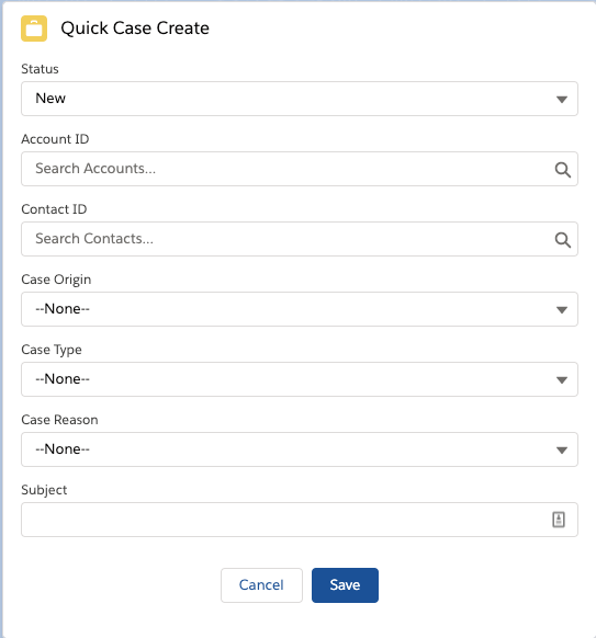
Creating a New Quick Case Component
In this section, I will show you how to build a component that let’s users quickly create a new case. The end result will be a component like this:
Quick Case Create Component
This component will use the recordForm base lightning component. Here is the code for the markup:
And here is the code for the client-side controller. Note that it includes a commented method that would handle validation, since the component unfortunately does not do this (at this time – refer to issue above). I don’t really consider this a workaround, since the whole purpose of the component was to eliminate the need for the additional code. I personally think Salesforce needs to fix it, and hope you agree.
({
    handleSuccess : function(cmp, event, helper) {
           cmp.find('notifLib').showToast({
            "variant": "success",
            "title": "Case Created",
            "message": "Record ID: " + event.getParam("id")
        });
    }
    // },
    // handleValidation : function(cmp, event, helper) {
    //     // NOTE: This method will handle validation if you specify which field to check for specifically, which is
    //     //  not a good workaround since the component should handle this for you without the need to write
    //     //  all this unecessary code (especially since the whole point of the component is to lessen the
    //     //  amount of code that needs to be written). That is why it was not mentioned in the actual course.
    //     var evtFields = event.getParam("fields");
    //     var reqField = 'Origin';
    //     if (evtFields.hasOwnProperty(reqField)) {
    //         event.preventDefault();  //Stops the record from being created
    //         cmp.find('notifLib').showToast({
    //             "variant": "error",
    //             "header": "Error was encountered",
    //             "message": "The following field is required: " + reqField
    //         });
    //     }


})
The code includes the notifications base lightning component. This is used to alert the user with a toast message when the case was added successfully.
Creating Quick Actions
In addition to including this component on the Sales Home page, I exposed it as a quick action and then created a global action using the following steps in Setup.
In Quick Find, type “global” and select Global Actions.
Click New Action.
Select “Lightning Component” as the Action Type.
Select the quickCase component from the drop down list.
Enter a label as “Quick Case Create” and tab to next line.
Click Save to Finish.
After creating the global action, you still need to add the new action to the Publishers layout, which you do using the following steps:
In Quick Find, type “Publisher” and select Publisher Layout.
Click Edit to modify the default layout.
Select “Mobile and Quick Actions”.
Scroll down to the section for Salesforce Mobile and click the override the predefined actions link.
Drag the Quick Case Create action onto the section.
Click Save to finish.
In the next and final post, I will go over the newly redesigned Salesforce Mobile App.


 saramorgan.net